1stAvailable
Head of Design & UX
2014 --> 2016
I lead a product redesign that took centre-stage of 1stAvailable’s IPO, and launched inside a 3-month deadline.
A healthcare service in need of surgery
1stAvailable (now MyHealth1st) provides a convenient, easy to use, online healthcare search and appointment booking service. This enables patients to book their healthcare appointments online, 24 hours a day, 7 days a week from their phone, tablet or computer.
Healthcare is a funny thing. It’s not important to most people until it suddenly becomes the most important thing. Ironically, getting great outcomes for your users means they’ll probably need to use your product less often. So how do you drive engagement for a critical product that people actively avoid?
I joined to tackle an ambitious goal: redesign the service and build it in 3 months in time for an IPO.
Rapid iteration to find easy bookings
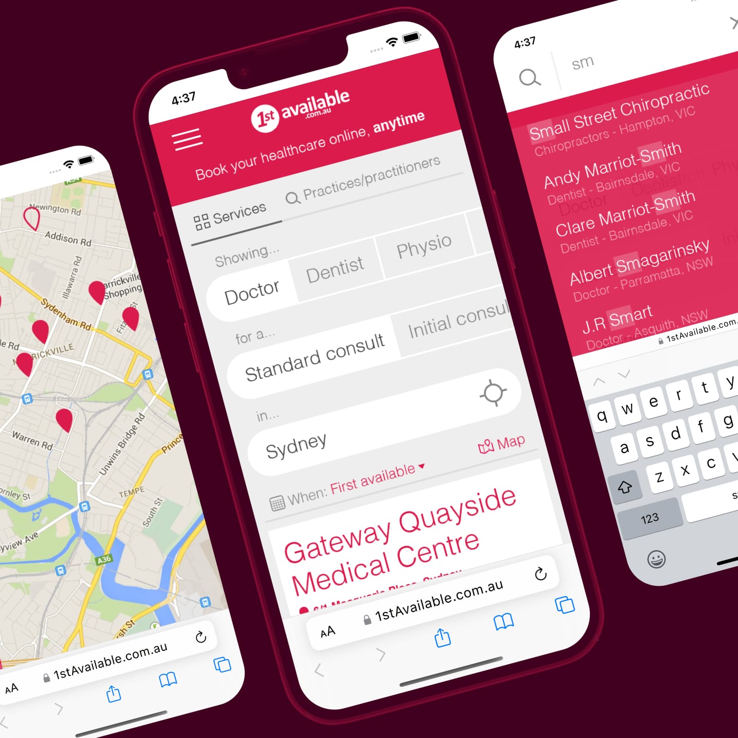
Previously, booking an appointment took six separate pages. After the redesign, I got it down to one.
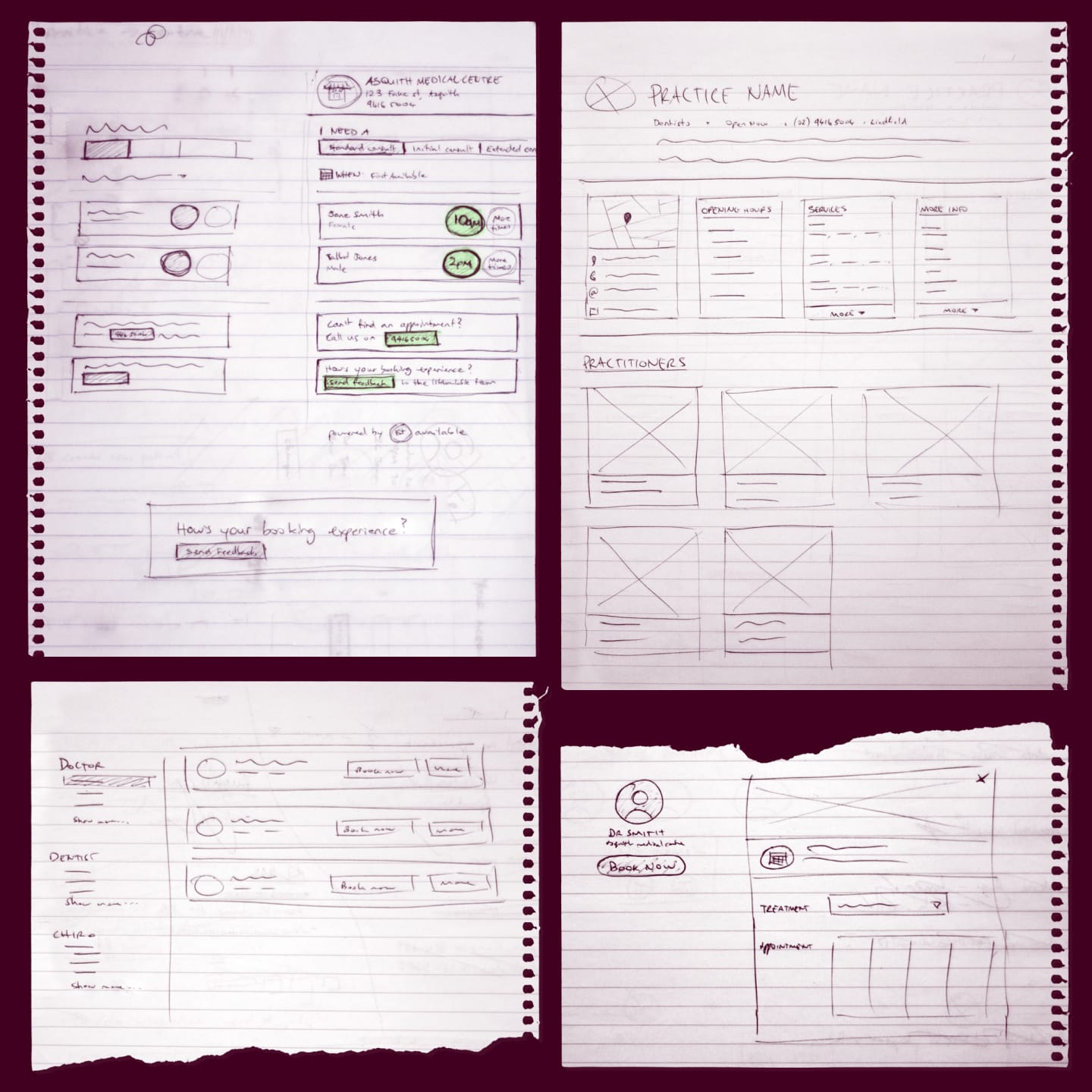
This was through a process of rapid iteration, driven primarily by extremely low-fidelity wireframes sketched on paper. This allowed for a concepting phase where any idea could be explored. This included wireframes designed by me, but also allowed for all other stakeholders to get involved — from support staff to developers, all the way up to the founder of the company.
The biggest gain was from an improved search experience. Previously, users needed to complete a full page of information before being shown any practitioners in their area. This added a lot of friction to the experience.
In the redesign, gathering information about a user was deferred until after they had selected a doctor. This meant that they could browse available doctors before having to commit time to filling in a boring form.
The next win came from pre-filled selections in the search, and dynamically updating the page. This made it much easier to make single-click changes to the search, and browse different areas by simply panning the map.
Finding quality over quantity
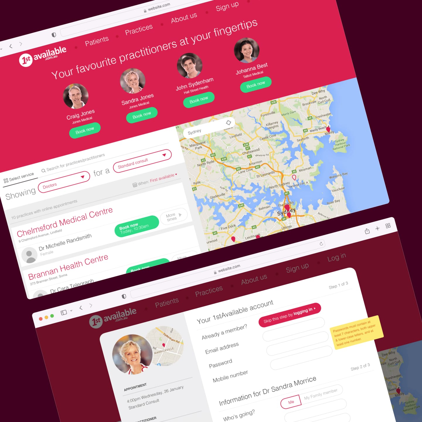
Patients have better outcomes if they see the same doctor. The redesign put this front and centre.
Once patients have left the service and are with their doctor, how can we know the best way to tailor the service to their needs. The key is with their next booking.
It’s well established that patients will have better outcomes if they visit the same doctor with each subsequent appointment. The redesign of 1stAvailable took this insight front-and-centre by turning the hero banner of the site into a space for patients’ doctors and practices. More than simply promoting these doctors in a user’s search results, they sit at a higher level and make the service their own.
This new feature allowed patients to schedule an appointment with their preferred doctor in just three clicks. It accounted for over 30% of bookings soon after launch, which far exceeded expectations.