Mathspace
Head of Design
2022 --> Present
I managed a design team of six, while spending half my time on the tools doing research & product design.
Day-to-day work
Mathspace is an online, personalised mathematics learning platform. It tailors mathematics learning pathways for students based on their knowledge gaps. Teachers can assign practice for their students, and review their progress as it aligns to their local curriculum.
When I joined, the design team had 4 product designers, and we quickly added 2 illustrators based in the Philippines.
As a manager, I worked with designers on the team with direction and feedback on their work, career development, and learning.
As Head of Design, I worked closely with our Head of Product, founders, and leadership team on our product’s direction while championing design across the wider org.
These responsibilities were split 50/50, with the remainder of my time spent on the tools doing research and product design.
Internal & external workshops
Much of Mathspace is made up of people passionate about teaching and eduction. Most of the sales team, for example, are ex-teachers. This means there’s a wealth of knowledge to be tapped into!
To capture this, I ran regular workshops to get all other departments involved in the design process — both as a way to tap them for new ideas, but also to create cheerleaders for features right from the start.
For internal workshops, we often had upwards of 20 people attending, which presented all kinds of challenges to keep people contributing without stepping on each others’ toes. What results was a highly efficient method of crowd-sourcing ideas and solutions to form a backlog for the design team.
I also ran external workshops with customers, using FigJam as an environment to let them collaborate with their peers. Doing this publicly also generated good-will for the business among our customers. It sent a message that we were listening and being responsive to their needs, and was generally very well received.
Solving student struggles
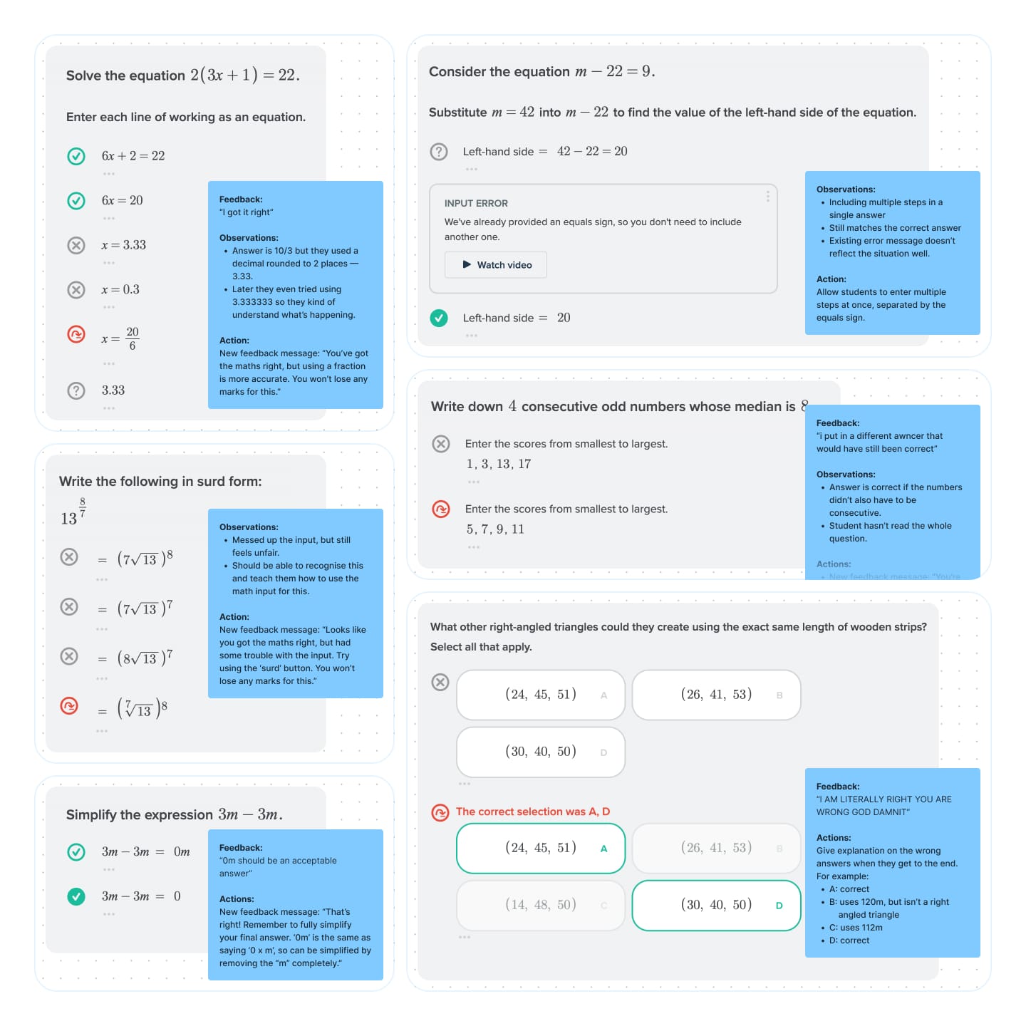
One of the great joys of working on a product that serves teenagers is reading through their feedback and comments. We have multiple touch points that allow this, but one of the areas we knew needed attention was the student workbook.
This is where student do most of their maths homework in Mathspace, and anecdotally we knew it was a big source of frustration.
It had previously been put into the too-hard basket, with no clear direction of where to start, and a general sense that it was too big of a problem to solve.
I sifted through negative comments students had left about the workbook, and went about matching that with their actual work. I’d match comments like “I’m right but it said I was wrong” with what actually happened.
Much of the feedback had previously been dismissed because students thought they were right when they had made a mistake. This was often the case, but a pattern started to emerge where it became clear that in many cases, students were being mislead by the UI.
With the help of our developers and PMs, I sorted my findings by effort and impact to find a number of fixes that would hit the sweet spot of low effort + high impact.
As we were rolling out each fix, we heard from teachers and students that they were noticing improvements. We also saw in our data that our “frustration metrics” had gone down. Both a qualitative and quantitative improvement.
Student and teacher interviews
Mathspace offers both paid and free versions of its app to teachers. This gave use two sources of customers to speak with for both general-purpose interviews and more targeted user-testing sessions.
Our teachers on the paid version typically came via our sales or support teams when giving direct feedback. I’d also reach out directly to schools that were highly engaged in specific features I was working on.
Our freemium teachers were a great source of new users, where we could gain insights into their first-time experience and test features they had little to no familiarity with. Working with the Marketing team, I set up an automated email campaign to new freemium users, so we had a constant stream of customers for our research.
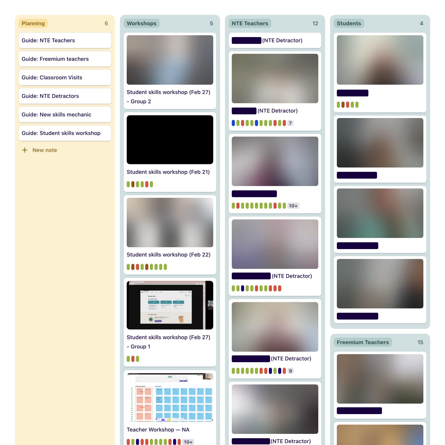
All interviews were recorded and organised in Dovetail, where transcripts were tagged using a taxonomy that covered areas like the product lifecycle, individual features, emotion, demographics, and the product journey.
This gave us a constantly growing source of insights to pull from whenever we picked up a new item of work. It meant every designer could hit the ground running with research-based designs for a very low investment of their time.
Designing for a GPT-based tutor
The vision of Mathspace has always been to create a tutor-like experience for students learning maths. The goal is to provide the right help at the right time.
For questions in the student workbook, Mathspace has many pre-defined paths that students can go down. Students can get help that is specific to the step they’re on. Given the variety of paths a student can take while solving a problem, it can be very labor-intensive to set this up, and inevitably there are gaps for students who go down unexpected paths, or make unexpected mistakes.
With the rapid progress of GPT, we saw a clear opportunity to make use of the flexibility of a large language model to fill the gaps of our existing setup. Combining this with the smarts of the existing math engine could supercharge this vision of a tutor for every student.
Prototyping a vision
This became a focus for the majority of our team. I created some rapid, high-level designs and prototypes to help steer this vision from the start.
As engineers built up a workable implementation, we iterated together to refine a feature-set that could be shipped to real students.
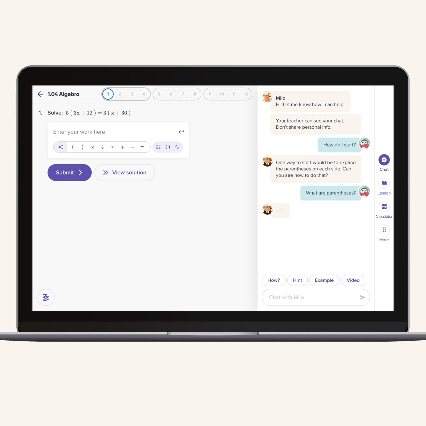
Our initial version simply replaced our existing pre-baked hints with GPT-generated ones, but we quickly evolved that to include dynamic prompting and an open input where students could interact directly with the AI.
Learnings from testing and interviews
As it was such a new area of exploration, both for us and schools, we initially released this as a closed-beta for schools who actively wanted to try it. Our Head of Product and I met directly with teachers to ensure we fully understood any concerns they might have had before rolling out too widely.
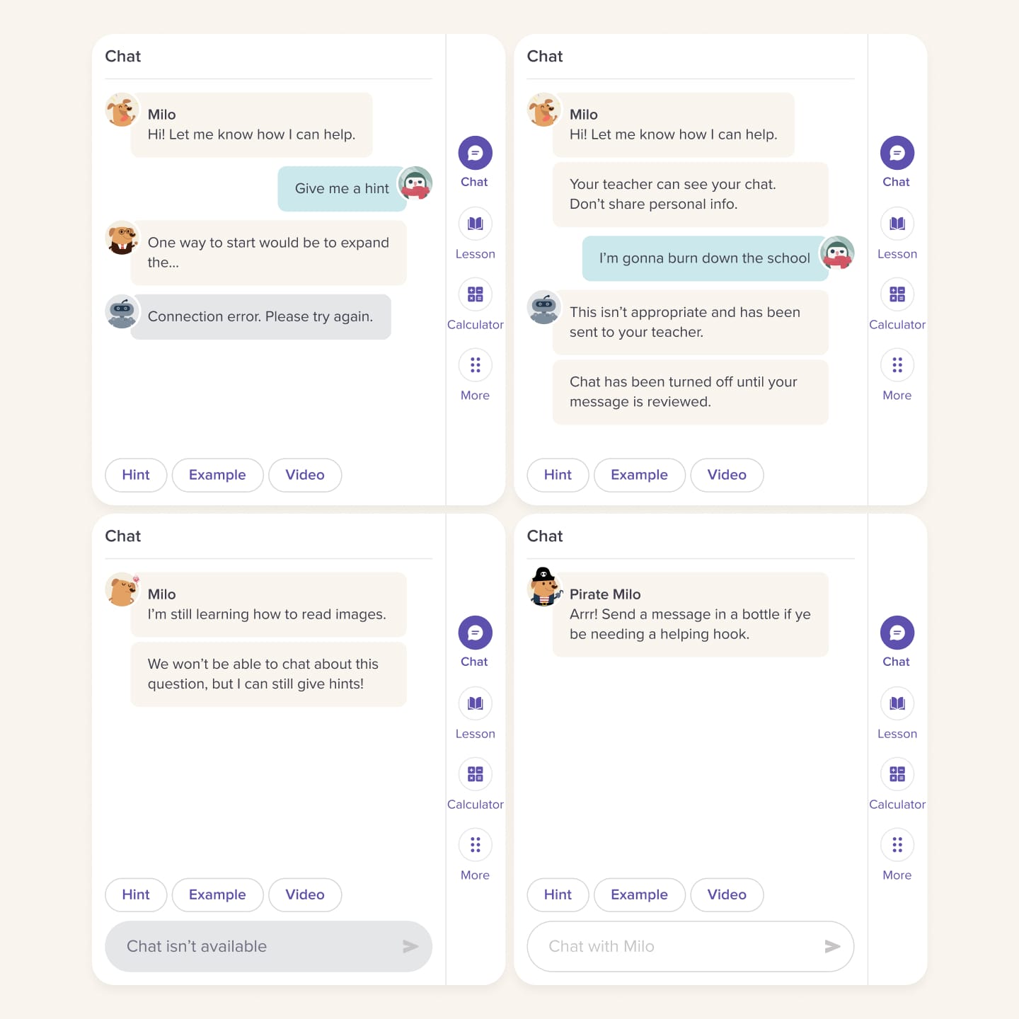
One early concern was around giving full access to GPT to students. We used insights gained from these conversations (and reviewing chat logs) to refine tools for moderation and control, to prevent conversations from falling off the rails.
Unpredictability and delight with GPT
In the beta period for our GPT tutor prototypes, we noticed several areas where we’d refinement: keeping things on-topic, moderation, robustness, and fun.
Keeping things on topic
With an open input box, kids will be kids. We took great care to review all messages as they came through in the early stages, in the hopes that we could learn from them. One of our early lessons was that kids love to test the boundaries of new things, and our chat experience was no different.
I worked with our engineers to find the right balance between keeping conversations on-track, without making things feel too strict.
Moderation
In a similar vein, we also noticed a number of students pushing things too far. As this was a concern from many of our beta teachers, we looked to address this with a simple moderation system.
Messages would be available for teachers to review whenever they liked, but we would also proactively send problematic messages to teachers so they could act on them accordingly.
Robustness
We could only support some types of questions in the beginning, so needed a way to explain this to students that felt natural. It needed to be clear what Milo was capable of, so that they understood what was possible.
We opted to use the chat format to do what it did best — communicate! Milo would be up-front about what he could and couldn’t do, so students were always in the loop.
To protect Milo’s character as a fun and helpful tutor, I added a robot character as a way of delivering bad news. This way Milo could always be seen as the fun one, and the robot could be someone you love to hate.
Fun
Because we were introducing a more personable way of interacting with the platform, we found that a lot of students wanted to interact in a more casual way.
A lot of students would ask Milo about what it’s like to be a dog, and whether he wanted a treat!
We already dress up our dog character Milo for special events, and so I explored ways for us to bring this kind of fun to the chat as well.
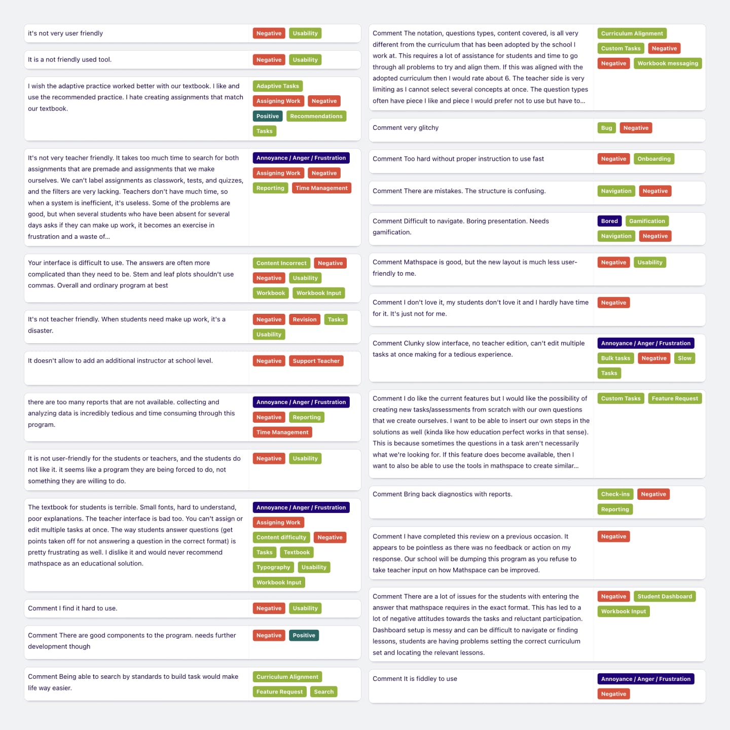
Learning from unhappy teachers
Another focus for me at Mathspace was to find ways to improve our teacher experience. It’s a platform that is very feature-rich, and had grown a lot over time. As with many platforms like this, it grew to a point where it became more difficult to use, especially for new users.
The research
From visiting schools and speaking with teachers, it also became clear that most users weren’t even aware of some of our flagship features. These were additions to the platform that had undergone significant investment, which was being wasted because of a poor user experience.
Every month, I imported our NPS results into Dovetail and categorised them with the same taxonomy from our customer interviews.
From there, I was able to form a collection of teachers that had left negative comments about specific features. I contacted these teachers directly to meet for interviews and user testing to learn more about how things could be improved.
The solutions
There was, of course, no silver bullet to magically solve the issues in our teacher experience. Rather, the results of my meetings with teachers formed the basis of a long list of small-to-medium sized improvements. This included things like changes to the navigation, onboarding, data tables, and a range of issues with hierarchy and consistency.
Over time, we were able to regain some ground in user experience that had been lost over time, while also gaining more good-will among new and engaged customers.