Rest
Senior Designer (Contract)
2018
I lead the UI on a team of three designers to concept, test and deliver a fresh experience for Rest’s super portal.
The brief
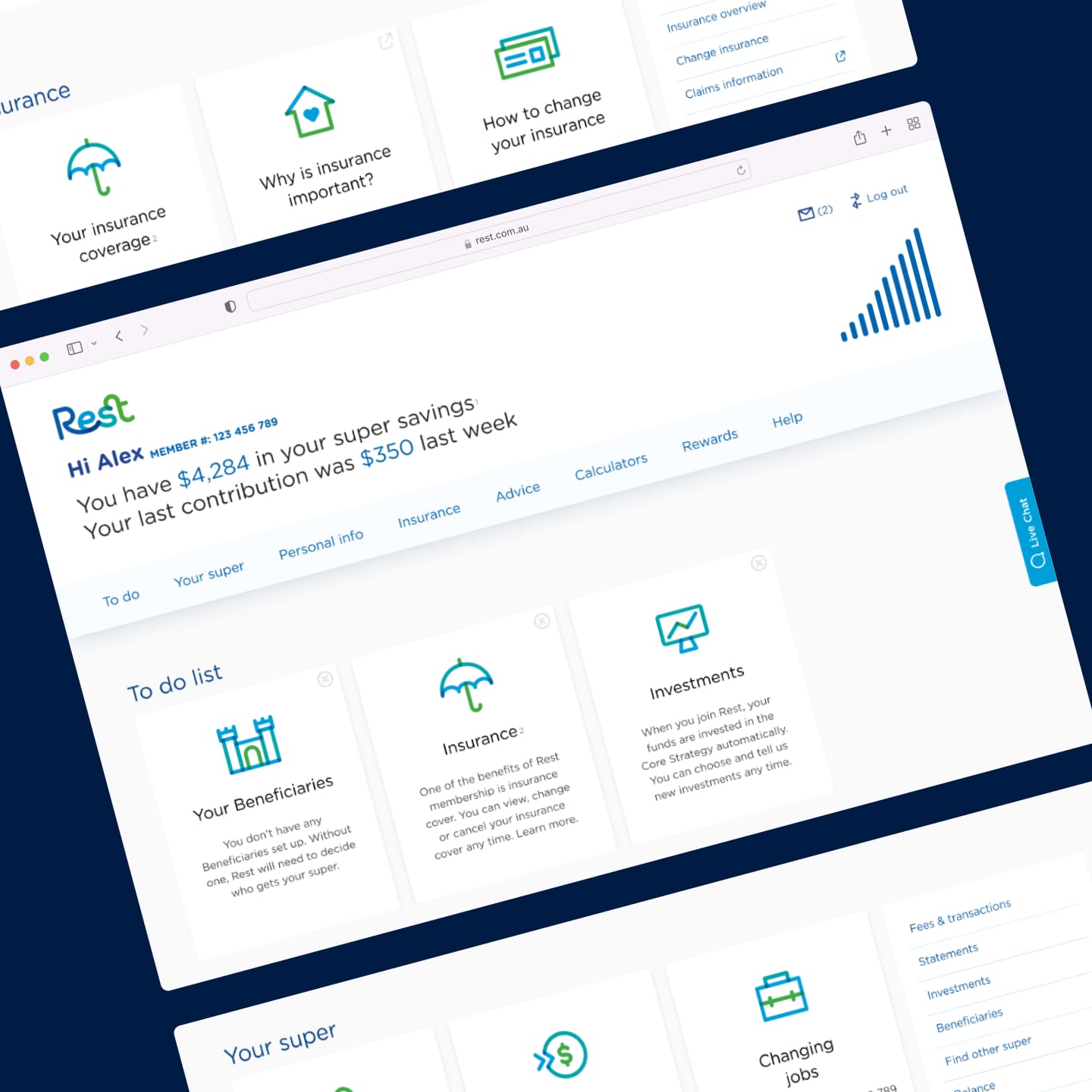
Rest needed a refined member portal for its young new members without alienating the oldies.
This project was with Massive Interactive, an agency that had a history in designing video-on-demand services.
This initially seemed like an odd coupling — a financial service designed by a team more familiar with entertainment apps? But this was all part of the plan!
For Rest, this lack of a background in financial services was seen as a strength. They wanted a service that threw let go of legacy ideas around financial services, and gave their customers something fresh and engaging.
They wanted something different from all of their boring competitors — a great brief to receive!
Super is for life
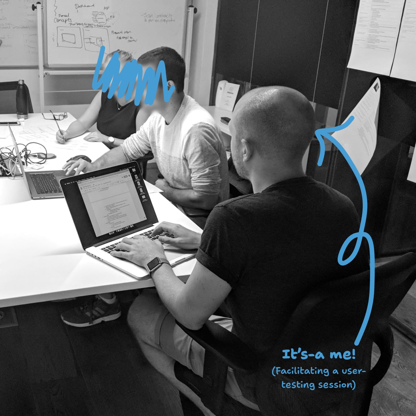
To understand the needs of their wide range of users, we (myself and the UX lead) facilitated interviews with people aged 18-70.
The types of insights gained from this were fascinating. Outside of the obvious stereotypes related to older generations being less capable with technology, we also tested with people who lived with things like mobility issues that affected their ability to use digital services. For example, one person needed to use two hands to scroll their mouse due to reduced dexterity — something most of us would take for granted.
As part of the brief for out-of-the-box thinking, we created two main concepts: one that was a more traditional dashboard inline with Rest’s competitors, and another that was much more fun and exciting.
We wanted to make sure that what was flashy and exciting was still going to be functional. We’d be creating something for managing peoples’ superannuation, after all!
After a first round of testing, we found what we had expected: the “boring” concept was more functional, but the sentiment around our “fun” concept was overwhelmingly positive.
Now the challenge was set. With two rounds of iteration and testing, we were able to update our “fun” concept to match the usability of the “boring” one. We had achieved the best of both worlds. This is what some of our testing participants had to say:
“I want to use this super. It’s so simple”
“Oh, that’s easy!”
“This is what I want!”
UI design lead
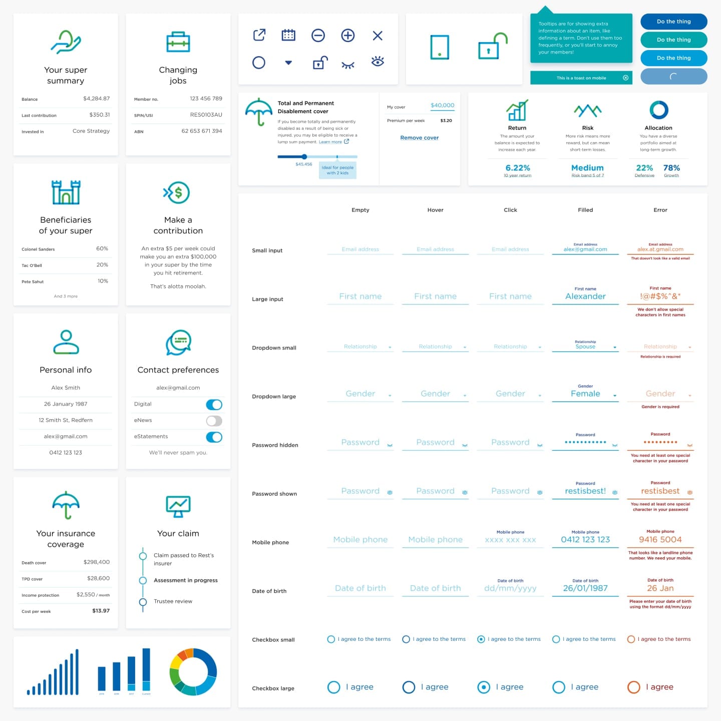
With our concept validated and stakeholders on board, I took the lead on creating a component library and UI system ready for developers.
Along with the new member portal, Rest had also recently undergone a rebrand. As the UI lead, I was responsible for ensuring our work aligned with this new look. This involved taking a fresh branding document — intended for print and offline applications — and translate that into interactive components that still feel part of that family.
This was then demoed back to exec-level stakeholders to ensure we’d captured the vision of their rebrand while adding enhancements for the digital world.
I delivered a design system built from the ground-up, so developers could easily nail the details.
This included high-fidelity screens across the entire new portal, and robust components that were flexible enough to be used by any new designers that joined the project in the future.
This was all put together in Sketch