Stan
Lead Product Designer
2020 --> 2021
I joined as a contract product designer, then took the lead after success with a few key projects.
Marketing pages
A redesign of 10,000+ promotional pages that lead to a boost in SEO and conversion.
When I joined Stan, a large part of traffic driven to marketing pages was from paid ads.
A plan was put in place to reduce this spend over time, so we needed an overhaul of all marketing pages with SEO in mind.
We focused on long-tail searches for things like specific shows and specific seasons rather than the homepage.
Previously, only high-profile movies and shows would get a marketing page. In the new world, all 10,000+ assets on Stan would have a publicly available marketing page.
This meant we’d need a solution flexible enough to be customised for high-profile shows, but could still be scaled automatically for lesser known titles that may have lower-quality assets and no hands-on curation.
I worked extensively with the marketing team to find a design that suited their needs across the lifecycle of an asset — from a pre-production announcement all the way to a beloved show with over 20 seasons.
I also worked with developers to ensure the designs hit all best practices for SEO, mobile, and speed.
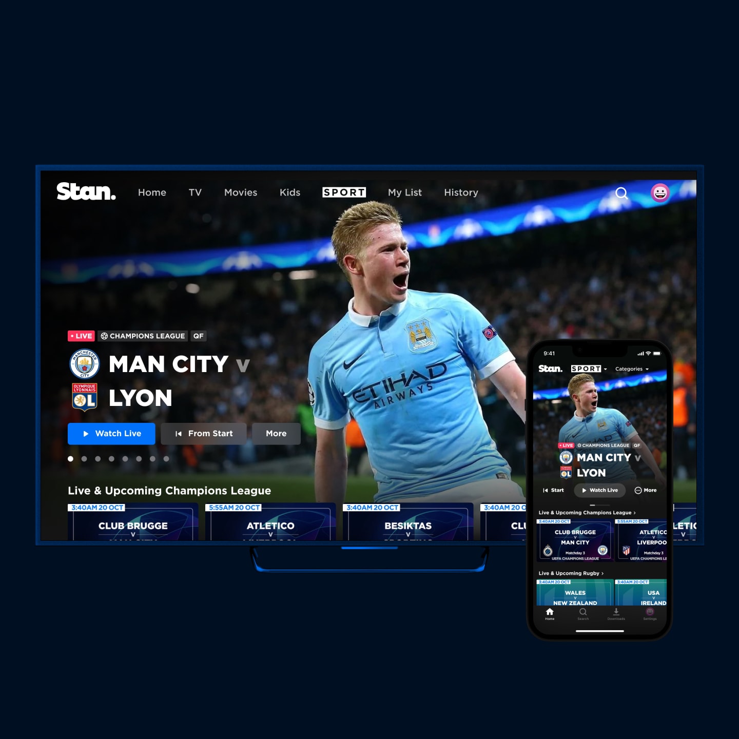
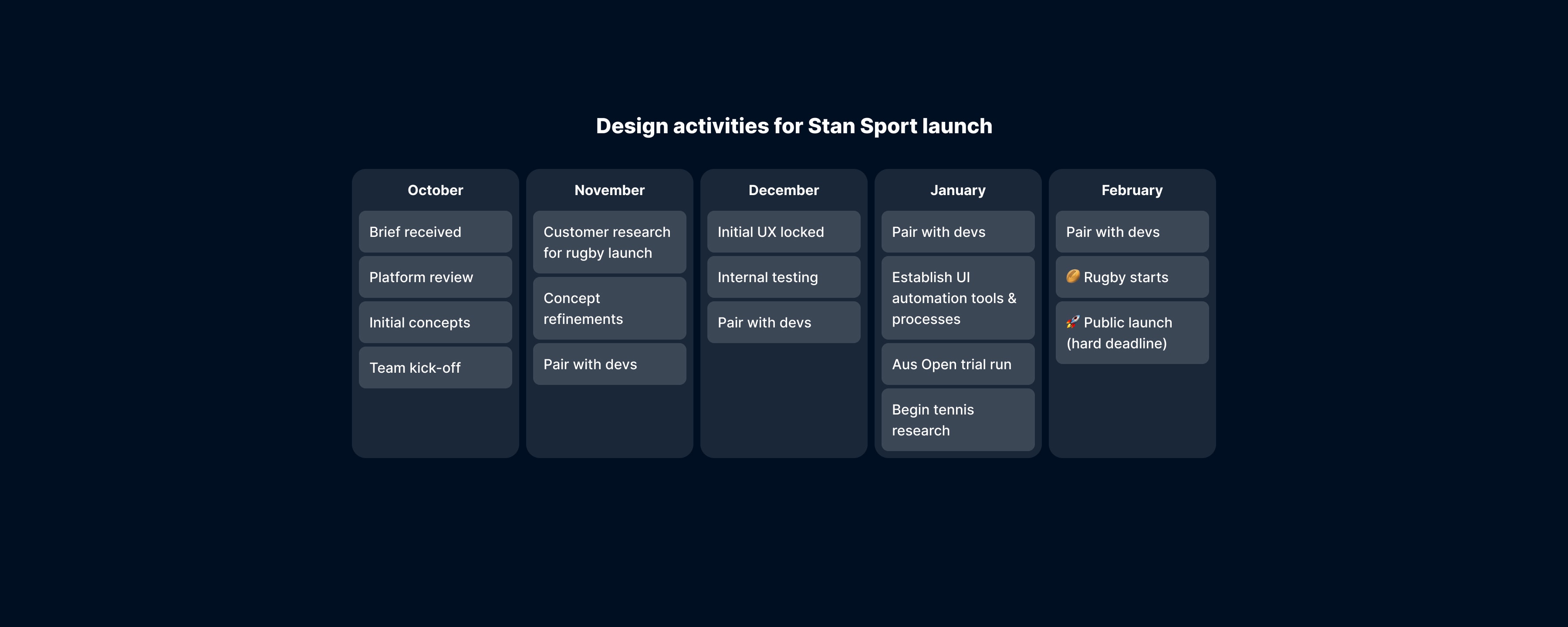
Stan Sport Launch
With a dozen platforms to launch in just a few months, I worked with PMs to craft the best possible MVP.
I leveraged prior experience with Optus Sport
Prior to being at Stan, I worked on a redesign of Optus Sport. Though the focus there was on soccer football, many of the same principles apply when thinking about a service for on-demand sport viewing.
From the extensive research of that project, I knew the basics of what would be required for any sport platform. We’d need to think about the weekly routine of following a sport, spoilers for those watching replays and the basics of managing the stream during live viewing. All this while considering the needs of everyone from casual to hardcore levels of fandom.
But with the launch sport for Stan being Rugby rather than Football, what else was there to know that wouldn’t carry across from research I'd done in the past?
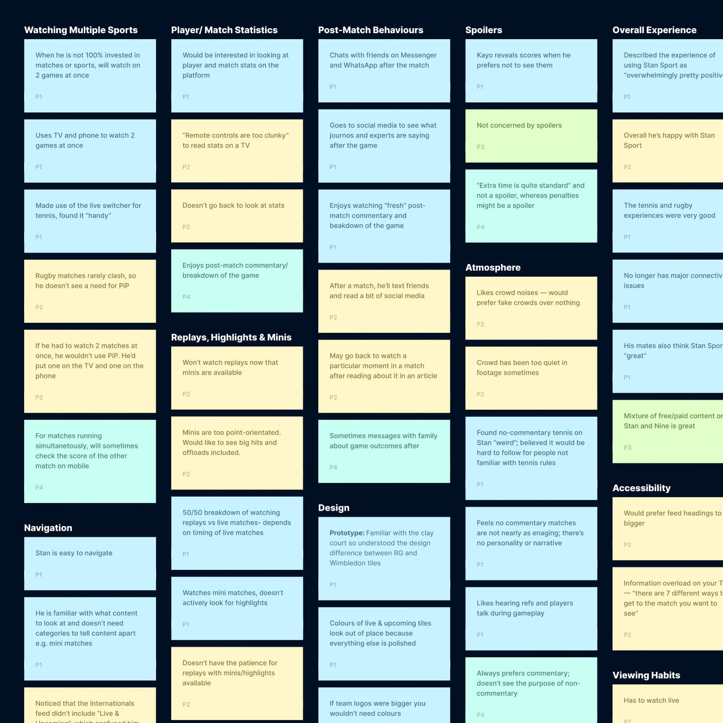
Rugby research
We had a great source of rugby fans from our head of sport, who wrote a regular newsletter to fans.
I spoke with a few of these, ranging from young uni students through to retirees who have been following the sport their whole life.
It became clear that we had their basic needs covered, but the conversations also highlighted the importance of getting the technology side right. Not surprisingly, high-definition picture at a high frame rate was critical to hardcore fans, followed closely by an effective commentary team.
Most of all, the most sought-after feature was to be able to watch the rugby without a Foxtel subscription.
High-level concepts for our MVP
With the core requirements and fan conversations in mind, I went about creating high-level concepts for what could become an MVP.
These were designed to illustrate what the service could be, to help conversations among developers and c-level stakeholders.
With a 3-4 month window before launch, we had to be ruthless in identifying the core features quickly so that we could get cracking.
Simple signup
Among the features within the platform, our head of product set a challenge: can we facilitate an upgrade of existing customers in one or two clicks? Refining the signup flow to hit this goal took collaboration across developers, designers, and marketers.
Live sport holding pages
Often, sport fans will open their app before the coverage begins. We wanted a simple way to allow them to automatically jump into viewing if they’d arrived early, rather than having to wait to press the play button when coverage begins.
This could have been a simple holding page with a static image, but the beginning of a match is a high-point of excitement and anticipation. A static image simply would not do!
I sourced and introduced stadium drone footage as a background asset as a way to emphasise the start of a match. Longer-term, we had hoped to pull through live-footage of people entering the stadium to make it more authentic.
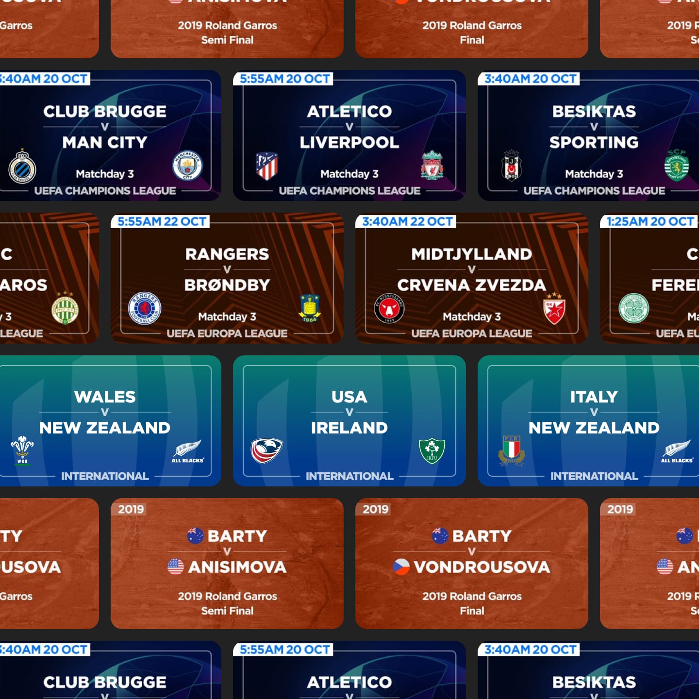
Content merchandising
Two critical points came from speaking with sport fans when trying to uncover what’s important to them while browsing a sport app.
The first is to be able to very easily discern which items are upcoming, live or replays while browsing. You don’t want to have to read every item one-by-one — it’s something you should be able to understand at a glance without thinking.
The other seems obvious, but many other services get it wrong — no spoilers! There’s nothing worse than avoiding the internet so you can watch an important replay, only to have the result spoiled by the description. Key moments in a match can also be given away with the artwork used, so I put together detailed guidelines for our content team to help when selecting match photos to be used.
I scaled the MVP to many platforms
From the concepts, we looked towards the launch. This meant diving into the details and creating detailed high-fidelity comps and flow diagrams to hand off to developers.
As we progressed, I worked closely with product owners and developers to refine things when we encountered issues.
Recapping a match in progress
With Sport, our focus was on prioritising the live experience. By default, you'd jump straight to the current point in the stream when joining just like on an old-school TV. There's no fuss to get straight into the action.
If you're joining late, an obvious downside to this is that you've missed all the action. You still want to watch from the current live point so that you can keep up with what's happening now, but for a lot of fans it's critical to know how you got there. When watching a traditional broadcast, your only real option is to wait until a break in play and hope for a recap. But we can do better.
Here you can see a prototype I built in Protopie as a way to explore how we might allow people to catch up on what they've missed during a live broadcast. Events are added to the progress bar, so you can see what happened and when. If you spot an interesting point, you can easily snap back to that point to watch it, and then jump back to the live point.
On a notoriously clunky platform like TV, it needed to be super simple to navigate with a basic remote control.
UI Design + Automation
I created an automated workflow with Figma to generate 10,000+ assets for the Stan Sport launch.
When launching Stan Sport, we had a few things come together to cause a very practical problem to resolve for launch:
Every show, movie and sports match on Stan required about a dozen images of various dimensions to suit all of the different platforms supported.
With the launch of Stan Sport, we would offer replays for international and club matches dating back to the 1990s.
A person has to manually upload imagery for each match added to Stan.
Do the maths on that, and you end up with a lot of manual drudgery for a lot of people to chew through to hit the launch date. It’s over 10,000 separate images that needed to be manually cropped and exported with a meaningful name, for someone to then manually upload. We didn’t have the budget to hire a team of people to manage this, and nor the time for a single person to tackle it.
UI automation to save the day
I created a ridiculously elaborate system of automation to solve this. If I’m honest, I still don’t know if it’s a work of genius or madness at this point.
Driven by a spreadsheet, our sport team were able to enter details of every match being added to the platform.
Images were automatically matched from team names to ones sourced separately.
This was then imported into Figma, which then — via a plugin — renamed a series of pre-made frames and imported all images into the right place.
The designer was then able to make any final layout tweaks, and then export.
Because of a Figma limitation, these frames were exported with generic names, like “Frame 1”, “Frame 2”, etc. Given a human was going to upload these to specific places, this created too much risk of mistakes to be made.
To solve this, I wrote a script from the original spreadsheet to batch-rename all files exported. This organised images into a meaningful folder structure with human-readable filenames.
Madness. But madness that saved hundreds of hours of work.
Watching multiple matches
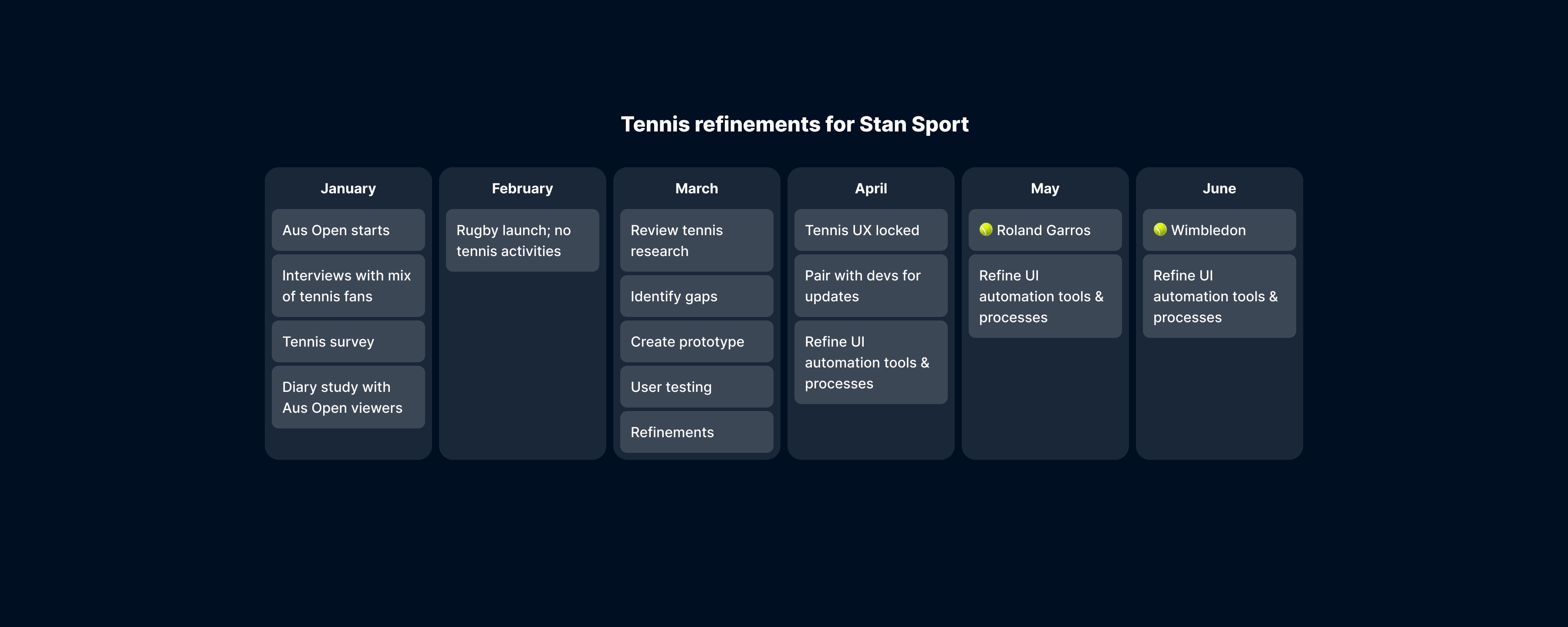
After a successful launch, we had to quickly turn to the next sport to be added to Stan Sport: Tennis.
The timing was great — the Australian Open had just started, so it was a perfect opportunity to conduct some research during a real tennis tournament.
I spoke with tennis fans, both casual and hardcore, to understand our gaps between the launch of Stan Sport for rugby, and our upcoming coverage of the French Open.
There was one main difference that came up between tennis and rugby: with our rugby coverage, there was only ever one match live at a time. This meant that our navigation that had been designed for movies and TV shows largely worked without needing to be changed.
Navigating tennis
Tennis tournaments can be over 10 courts of play, all happening at once. This affected us in two ways.
The first was relatively straightforward: what’s the best way to organise all of this content to make it easy to find the match you’re looking for.
The second was the way tennis fans liked to watch. With so many matches happening at once, tennis fans will often juggle multiple channels at the same time. Typically, there will be one main match holding most of their focus, with 1-2 others they may periodically switch over to. This could be due to big players having matches at the same time, or just wanting to watch all of the Australian players.
Because our apps were designed to watch one movie or show at a time, switching matches like this would be incredibly clunky.
The fix
Although it offers the best live sport viewing experience, the clunkiness of remote controls meant our TV apps were going to offer the worst experience for switching between multiple matches. With limited time to launch, TV became the lead platform to solve this issue.
Simplicity is key when designing for TV — by placing the switcher below the main timeline, it could be summoned with a single button press. It also meant that changes to the rest of the player UI would be kept to a minimum, helping us hit our timeline for launch.
Another key issue to solve was how to make users aware it existed. I experimented with three versions during testing, where I played with different options for the timing of the hinting. The most successful was to show the hint just after the video begins playing.
This video is a capture of prototype I made for user testing using Protopie. Did I fool you with the fake loading states? It looks pretty real! I even tested it with a bluetooth TV remote.
This testing gave us confidence that we had the right solution for the switcher, and that it was worth investing in. This prototype also gave us a path forward for future refinements — set times and upcoming matches woudln't be in scope at launch, but we anticipated they would be highly desirable.
Content Merchandising
SVOD services can easily become a wall of rectangles. I prototyped better ways to showcase content.
We had a goal to make Stan more than just another digital video store.
Outside of just making our service more engaging and fun to use, our content team had no practical way to give weight to different kinds of content. Beyond a hero carousel at the top of our apps, the rest appeared exactly the same regardless of its value.
I worked with our content and marketing teams to create concepts to elevate our content, without turning it into a carnival of things grabbing for your attention.
This video is a capture from a prototype I made with Protopie at medium-fidelity. We used it to evaluate new ideas quickly both within the team and with user testing participants.
Continue watching
Using a landscape aspect ratio to break the feed of portrait tiles, these also make use of episodic imagery. This means gives you two things: fresh imagery if you’re watching a show with lots of episodes over a long period of time, and some context to where you’re up to with up-to-date characters appearing as you progress.
Inline trailers
Fairly straightforward, this allowed us to have a secondary row of trailers lower down the page. This was great for promoting upcoming content that hadn’t launched yet.
Vertical videos
This served two purposes. One was to simply show larger-format tiles to give higher prominence to the feed, and another was to be able to have dynamic video content available without sacrificing the number of items visible in the row.
Collections
From James Bond to The Hunger Games, so much of Stan's content exists as part of a larger whole. The collection feed allowed us to keep it all in once place, and highlight high-value collections to tempt super-fans.
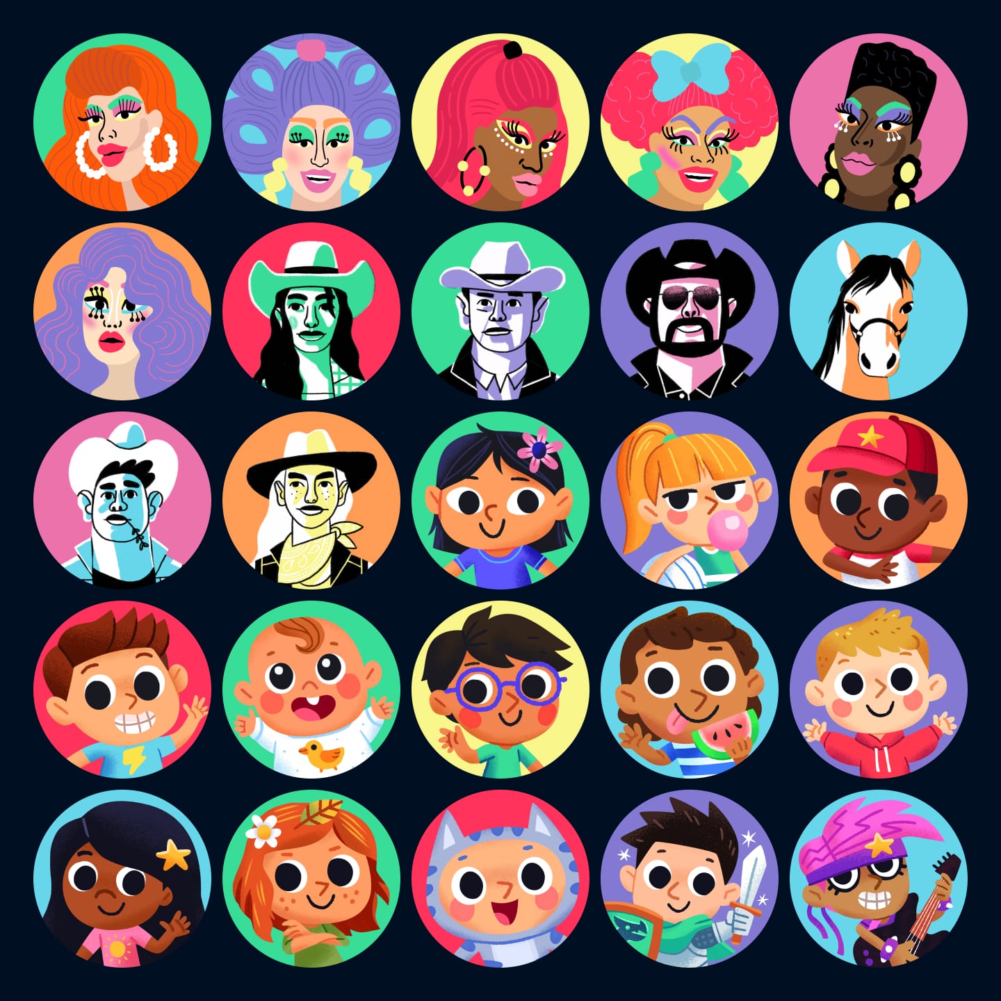
Art Direction for profile pics
Working with illustrators, we expanded Stan’s profile pics, inspired by content on Stan.
From an initial set of simple emoji as profile pictures, we wanted to expand this into a series to celebrate content on Stan.
Rather than sourcing from a single artist in one style, we decided that a better reflection of the diversity of content on Stan would be to work with a different illustrator for each set.
The initial sets celebrated some of our most popular content: RuPaul, Yellowstone, and our kids’ content.
I wrote the briefs, gathered mood boards and gave initial art direction to illustrators. Following initial sketches and concepts, I consolidated feedback from stakeholders internally to finalise the profile pics.