Burst for reddit
Side Project (Sole Contributor)
2018
I designed, built, and launched this iOS app, which uses a novel UX to solve filter bubbles on reddit.
Solving Filter Bubbles
Fake news and echo chambers. How do you burst your filter bubble if you don’t know you’re in one?
With reddit, anyone can create a community and users subscribe to the communities they’re interested in. This works great for hobbyist discussions, but for anything news-related it creates filter bubbles almost by design. Reading conflicting opinions is hard, so most people will choose to avoid such discussion.
So can we solve this problem? Burst aims to do this by automatically merging multiple discussions into one — seamlessly bringing outside voices into otherwise polarised conversations.

Unique Reddit UX
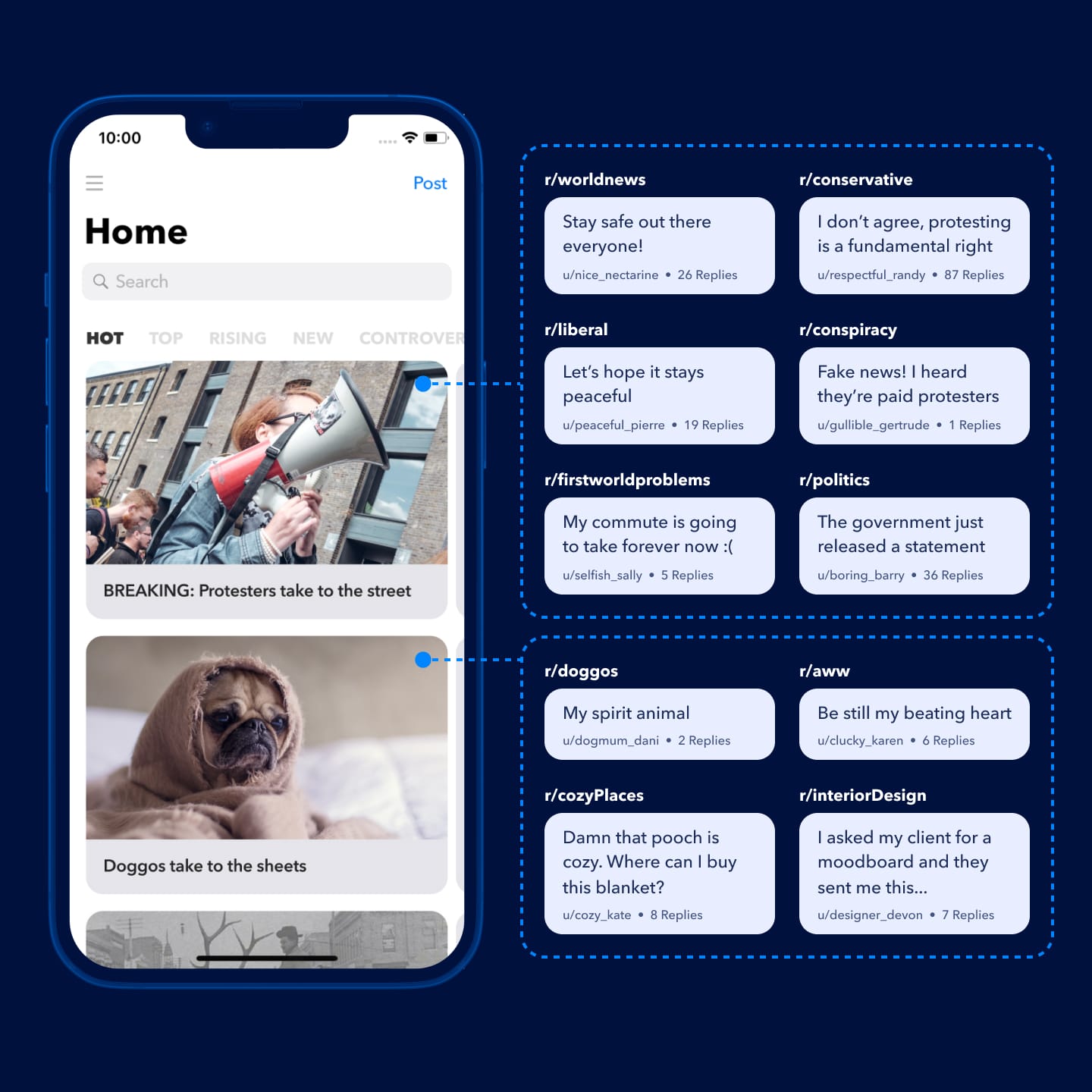
Burst merges post discussions from all subreddits to give a combined summary of all perspectives.
If a news article about an election result is posted to the politics community, Burst also finds discussions in conservative, liberal, environmental and even satire communities.
This approach to UX on reddit is unique to Burst. Most other apps are simple a vertical feed of links. Given that, this was also an opportunity to re-think what it means to be a reddit client.
As a pet-project, I really only had one stakeholder to satisfy — myself! I stripped out all UI clutter that has built up to support the wide range of users to leave a UX that is highly opinionated. Sorry, everyone else.
Plenty of reddit features were deliberately removed in favour of an experience that is simple and clutter-free. I’m more of a lurker than a contributor to reddit, so even core features like up and downvotes were taken away from the primary interface.
Another focus of the project was to incorporate a gestural UI with smooth animations.
Fluid gestures
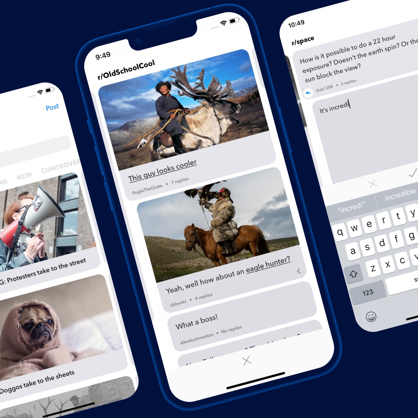
Burst uses a novel UX where you navigate with gestures that are tied together with seamless transitions.
This new paradigm of swiping between comments calls for animations and transitions to aid users’ learning and understanding of the UI. From a list of posts, how can we signal to users that each can be swiped over without resorting to a verbose label?
To address this, each post’s first comment appears as a hint slightly off-screen. When swiped, the comment transitions to its full height and position. In practice the transition is invisible, but this simplicity is driven by a complex system.
Built in React Native, out-of-the-box animations are typically performed in Javascript — typically very sluggish for anything non-trivial. Burst makes use of the native driver with complex masking to achieve a performant and fully interactive transition.

Data on-demand
Slow network requests could put a stop to this gestural UX, but a few smart approaches to requesting data save the day.
The biggest obstacle for Burst’s approach to discussions is that network requests are slow. Burst uses some novel approaches to requesting data from the reddit API.
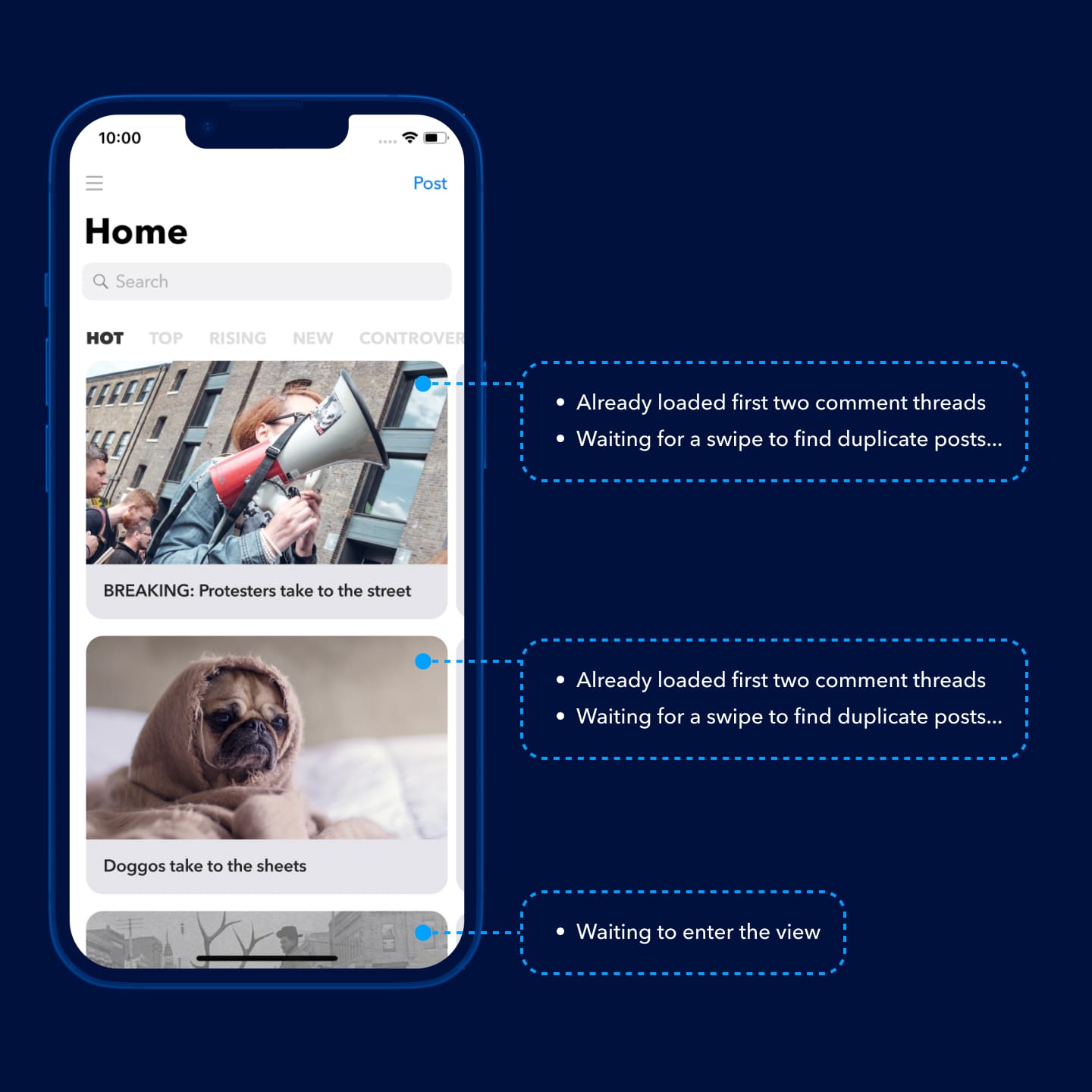
Typically, clients request data from a server one-by-one at the user’s request. Burst anticipates user behaviour and makes these requests ahead of time. As the user scrolls through their feed, comments are already being fetched behind the scenes. That means that by the time a user chooses a story to discuss, comments from the original post are already available.
As soon as a user enters a posts’s comments, Burst kicks into high gear. At this point, it’s looking for duplicate posts, fetching relevant discussions and merging it all together. All this takes place while the user is reading the first batch of comments already available to them. By the time they’re ready to move to the next set, Burst is already done processing it all for them.
None of this complex, behind-the-scenes logic is exposed to users. To them, Burst just feels faster.

In TechCrunch & more
At launch, Burst was featured on a number of tech blogs, and hit a #41 globally in news on the App Store.
TechCrunch
“Burst breaks you out of your filter bubble on Reddit.”
MacStories
“A beautiful app with a design that feels fresh and modern.”
MobileSyrup
App of the week. “A very slick Reddit client.”
★★★★★
“It’s like Apple decides to make a reddit app”
— PINGU543
★★★★★
“Best reddit reader!! I’m in love with this app.”
— Ana Luiza Alves
★★★★★
“Super unique ... unlike anything I've used before.”
— liamdvsn
“This is very inventive. Really.”
“Wow that's really cool”
“This is brilliant.”