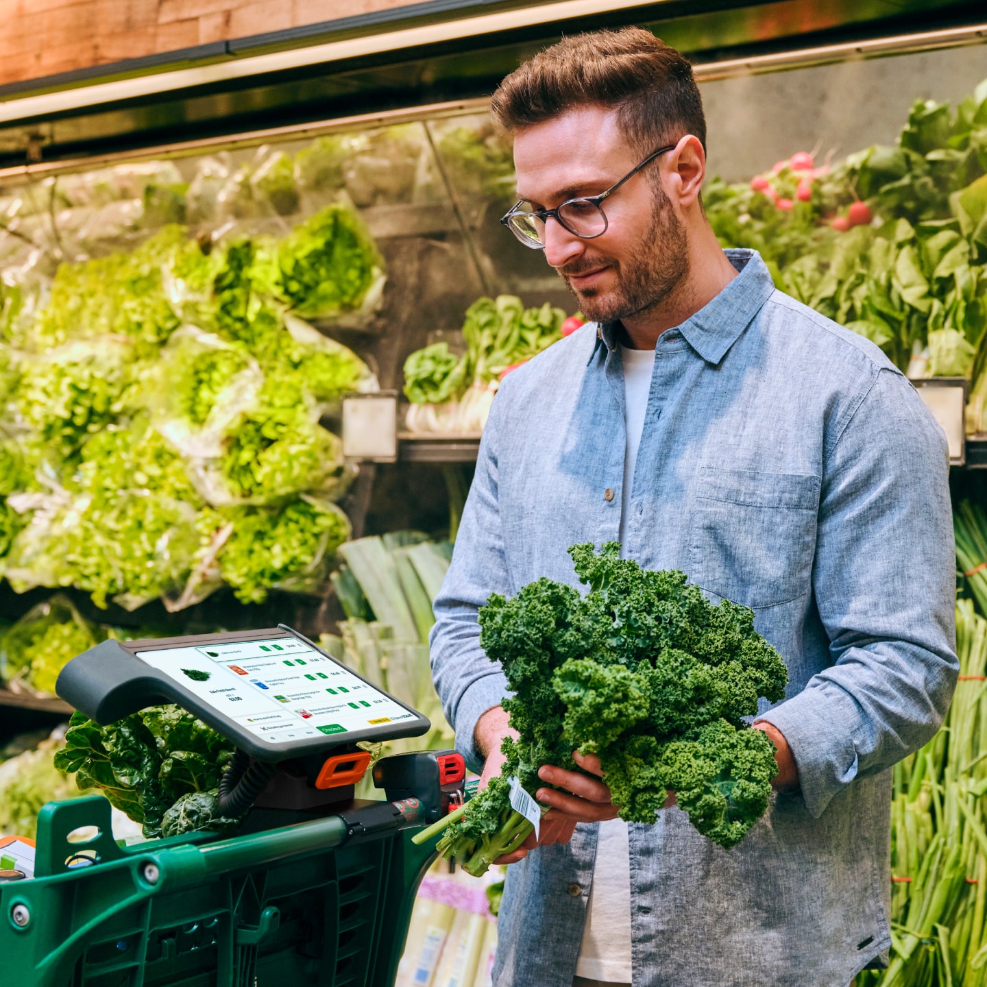
Alex DuckmantonUX / UI / Product Designer

I’m a pretty cool guy based in Sydney. I’ve also worked abroad in Soho and Silicon Valley. If you need help on an interesting project, shoot me an email or call 0412 123 123 and tell me all about it.

Research & Strategy

I’ve facilitated stakeholder workshops for brand new products, evaluated existing ones with in-depth usability studies, and more.

UX / UI Design

I transform complex, vague, or non-existent briefs into beautiful, intuitive products that users love & businesses can be proud of.

Development

I walk the walk in delivering products to market with productive handover & support, or by taking on development myself.

Optus Sport

UX / UI Design & Strategy

Rethinking Optus Sport's design & strategy through collaborative workshops, rapid concepting, and a user-centred design process.

The brief

Optus had a number of goals: first - establish a clear strategic direction for the product and revamp its look and feel. From there, rework the whole experience based on both the new strategy and identity.

My role

As project lead, I created the project plan to meet our goals within the fixed-time budgeted. Throughout the project, I was hands-on designing both UX and UI of the new experience, running user-testing sessions, presenting to executive-level stakeholders, and managing the workload of other designers on the team.

The process

With a fixed-time allocated for the project, finding the right balance of pie-in-the-sky concepting and detailed design was critical.

The first third of the project was dedicated to establishing a strategic direction for the product, and involved collaborative workshops with a range of stakeholders, early rough concepts, and user testing to evaluate new ideas. The deliverable for this phase was an online toolkit, suitable for anyone working on Optus Sport (from developers to designers to product managers to executives) to establish a baseline experience and ensure all parties are headed in the same agreed direction.

The remainder of the project was spent in detailed design. For this phase, we worked in regular 2-week sprints and dove deep into the detail of specific features across mobile, tablet, responsive web, and TV. We typically spent the first week creating screens and prototyping, with user-testing early in the second week to leave room to finalise our designs based on any new insights.

More about Optus Sport

Rest

UX & UI Design

A fresh superannuation portal suitable for anyone aged 18 to 80.

The brief

With a member access portal gathering wrinkles, Rest were looking for a brand new experience suitable for its relatively young acquisition pipeline without alienating older members.

The challenge

One of the biggest challenge for this project was around educating users about super and how it works. For many, super is something they actively avoid outside of major life events like changing jobs. Over time, it becomes a black box of savings with no connection to your life right now. We needed to make things simple enough for these types of people without alienating more engaged users typically closer to retirement.

My role

As UI Design Lead I was responsible for creating a new look & feel for the portal that was in line with Rest's new brand, presenting new concepts to stakeholders, facilitating user-testing sessions, delivering production-ready screens and UI components, and liaising with developers after handover.

More about Rest

DirecTV Now

UI Design

Bringing the huge video service to every platform under the sun.

The brief

DirecTV Now is a subscription streaming television service owned by AT&T. The core product for the web and Apple devices was designed by their in-house team, with experiences across Android, Windows, Roku, FireTV, Xbox, and Tizen being adapted by my team.

My role

As a Senior Visual Designer, I was responsible for the final screens and UI components delivered to stakeholders and developers. While the project was being established, I also stepped into a project management role in order to better organise the team. I created and implemented a fortnightly sprint plan including regular planning sessions, retrospectives, and preparations for client presentations.

The challenge

This project required a deep understanding of a wide variety of platforms. From the start, we aimed to find the right balance between delivering a consistent experience across devices, while respecting platform conventions so that each experience felt native and natural.

Given the scale of the project – with development teams scattered across the globe – it was critical to deliver our designs with a high level of fidelity, with components fully broken down and specified in detail. I maintained UI kits across android, windows, and several tv platforms.

More about DirecTV Now

Burst

iOSDesign & Development

Fake news, echo chambers and unconscious bias. How do you get out of a filter bubble if you don’t even know you’re in one?

With reddit, anyone can create a community and users subscribe to the communities they’re interested in. This works great for hobbyist discussions, but for anything news-related it creates filter bubbles almost by design. Reading conflicting opinions is hard, so most people will choose to avoid such discussion.

Burst solves this problem by sourcing discussions from every nook and cranny across the site, and intelligently merges them together. So if a news article about an election result is posted to the politics community, Burst also finds discussions in conservative, liberal, environmental and even satire communities.

Fluid animations; natural transitions

This new paradigm of swiping between comments calls for animations and transitions to aid users’ learning and understanding of the UI. From a list of posts, how can we signal to users that each can be swiped over without resorting to a verbose label?

To address this, each post’s first comment appears as a hint slightly off-screen. When swiped, the comment transitions to its full height and position. In practice the transition is invisible, but this simplicity is driven by a complex system.

Built in React Native, out-of-the-box animations are typically performed in Javascript — typically very sluggish for anything non-trivial. Burst makes use of the native driver with complex masking to achieve a performant and fully interactive transition.

Data on-demand

The biggest obstacle for Burst’s approach to discussions is that network requests are slow. Burst uses some novel approaches to requesting data from the reddit API.

Typically, clients request data from a server one-by-one at the user’s request. Burst anticipates user behaviour and makes these requests ahead of time. As the user scrolls through their feed, comments are already being fetched behind the scenes. That means that by the time a user chooses a story to discuss, comments from the original post are already available.

As soon as a user enters a posts’s comments, Burst kicks into high gear. At this point, it’s looking for duplicate posts, fetching relevant discussions and merging it all together. All this takes place while the user is reading the first batch of comments already available to them. By the time they’re ready to move to the next set, Burst is already done processing it all for them.

None of this complex, behind-the-scenes logic is exposed to users. To them, Burst just feels faster.

More about Burst

Beetroot

Android, iOS & WebDesign & Dev

Supporting Australian community radio with a clean, modern app for iOS, Android and the web.

Beetroot aims to give back to Australian community radio by providing a clean, modern client for stations across the country. Built from the ground-up with community radio in mind, it’s an OTT service that goes above and beyond the expectations of listeners by providing an enhanced listening experience with simple hooks to help stations get by.

A deep listening experience

What more is there when it comes to radio? The station provides the music; you provide the ears. That’s it, right? Not quite. Beetroot enhances the listening experience by providing rich context to what’s going into your ears.

Hear a song you like? Beetroot’s already found the artist and track title, along with links to save it on Spotify and Apple Music. Maybe you’d like to buy tickets to see the artist live? No worries — Beetroot’s found their next gigs for you too, all in a single tap.

Spectacular Support

Getting support from their listeners is a big priority for community radio stations. Beetroot addresses this by offering quick links to each station’s donation, volunteering and merchandise pages.

For users actively listening to a station, links are provided in the playback screen. For those actively looking to support a station, links are provided as a first-class citizen in Beetroot’s tab navigation.

The nitty gritty

Beetroot makes use of several APIs to seamlessly pull various sources of information into one. The web application is built using React, Socket.io and Node. The iOS and Android apps make use of React Native — giving it a single codebase across platforms to cut costs and speed up development time.

While listening to the radio, I found myself constantly searching for three main pieces of information - a recently played artist on Spotify, their upcoming gigs, and related chatter on social media.

More about Beetroot

Serenitec

Responsive Web Design

A big redesign for a big-data firm.

Serenitec works closely with businesses and institutes on a variety of R&D projects to transform their data into useful insight, information and practical solutions. They specialise in customised data analysis and software solutions.

The redesign of Serenitec’s website involved taking a good look at who they are and what they offer to their customers. What are the most important things they want to tell prospective customers and how can it be presented in a way that is understandable, without downplaying their expertise in a complex field?

Without abandoning the content-rich approach to the site’s previous design, the new version provides a structure that allows readers to easily parse the page to find what’s relevant to them. On both mobile and desktop, the responsive design uses progressive disclosure to allow users to drill down when they find a topic they’re interested in.

More about Serenitec

1stAvailable

Android, iOS & WebDesign & Dev

How do you redesign a service that is literally clinical? Make it about the users.

1stAvailable (now MyHealth1st) provides a convenient, easy to use, online healthcare search and appointment booking service. This enables patients to book their healthcare appointments online, 24 hours a day, 7 days a week from their phone, tablet or computer.

Healthcare is a funny thing. It’s not important to most people until it suddenly becomes the most important thing. Ironically, getting great outcomes for your users means they’ll probably need to use your product less often. So how do you drive engagement for a critical product that people actively avoid?

Remove friction

Even with only a few years on the market, before its redesign 1stAvailable had some legacy ideas and patterns. One of the earliest goals was to reduce friction for people to make their first booking, and then subsequent bookings.

Earlier versions took over six full page loads to finalise an appointment. The redesign was built as a single-page application, reducing that to one.

Know your users

Patient outcomes is a difficult metric to track. Once they’ve left the service and are with their doctor, how can we know the best way to tailor the service to their needs. The key is with their next booking.

It’s well established that patients will have better outcomes if they visit the same doctor with each subsequent appointment. The redesign of 1stAvailable took this insight front-and-centre by turning the hero banner of the site into a space for patients’ doctors and practices. More than simply promoting these doctors in a user’s search results, they sit at a higher level and make the service their own.

This new feature of the redesign generated significant engagement, and allowed patients to schedule an appointment with their preferred doctor in just three clicks.

More about 1stAvailable

PlayStation DevNet

Design

An injection of design-thinking into a decade-old platform critical to PlayStation developers and publishers around the world.

DevNet is PlayStation's global development platform, facilitating developer and publisher support, internal communication, documentation, file consumption, and the management of several bespoke processes key to PlayStation development.

At the time of starting the project, DevNet was — and still is — critical to the creation of PlayStation games for developers and publishers across the world. It had been developed internally, and grew organically without a meaningful design effort for over a decade.

Enter user-centred design

Usability and design were front-of-mind for the team, but what’s the best way to approach the redesign of a platform so critical to the business? Answering that question became a central part of the project as it started.

Clues to find the answer came from extensive interviews and reviews with users of all stripes. From support staff using the platform all day every day, to game developers accessing documentation and SDK updates, to publishers getting things out the door at the end of a long development cycle.

Moving forward we identified critical changes to be made. The platform’s main navigation was to be overhauled along with significant signposting updates, including breadcrumbs, quick links and colour coding. While making these structural changes, a fresh coat of paint would be applied across the board.

More data!

Knowing the path forward, it was important to gather more data to inform the updated information architecture and structure of the site.

Time for some card sorting! Each area of the navigation was painstakingly documented and given to dozens of users to sort into categories. This data provided invaluable insight into how various users understood content on the platform, and was used to form the redesigned IA.

This research also revealed unexpected insights into how some users prioritised content on the platform. When being asked to name their content groups, one developer used “Docs”, “Support” and “Other shit I don’t care about”. Again, this all factored into how we promoted various content within the redesigned navigation.

Design; prototype; repeat

Prototyping was a core practice in the redesign project and was crucial to its success. Prototypes were various levels of complexity, from sketched paper prototypes all the way to fully-functional builds polished for production.

Regardless of the complexity, the goals were the same — determine users’ understanding of the new UI; document any potential usability issues; iterate quickly. Testing with about half a dozen people turned out to be the magic number. That way the testing cycle was kept short enough to iterate on a prototype multiple times within a single week.

More about PlayStation DevNet

Thumbcinema

WebDesign & Development

A simple, intuitive tool for creating flipbook animations without complex industry tools.

One of the goals of Thumbcinema was to explore a user interface that doesn't lean on text as a means to provide feedback to users.

When creating a flipbook with Thumbcinema, all UI elements communicate via animation. Create a new page, and it flows in from the right with existing pages shifted over. Delete a page, and it falls from the stage.

Users don't need to be told what's going on, because they're shown in physical terms how the UI has been updated.

More about Thumbcinema

Scrum Postcards

Design & Prepress

An illustrated series of postcards depicting sprint retrospective actions, used as office decoration

As part of sprint retrospectives at PlayStation, action items are often generated to address any changes or additions to processes or workflows. This series captures a number of ongoing actions, and are used as decoration around the office.

They are printed as real postcards, and were occasionally mailed across the pond to other teams engaged in the project.

More about Scrum Postcards

Bras N Things

Web Design & Development

A campaign to launch Bras N Things’ Facebook page with a bang. 42,000 Likes ain’t bad.

The project was a multi-channel effort, including a microsite, Facebook app, eDMs and in-store print material.

The voting mechanic in particular was given a great deal of thought in order to capitalise on the viral nature of social media. The Facebook 'Like' button was used to vote in the competition. This meant that any vote given would be pushed to each users’ profile. This would be spread to friends of this user via their News Feed, creating a rudimentary viral spread.

After 10 weeks of the competition running, we’d achieved over 42,000 Likes — making it the fastest growing Facebook page of any Australian retailer at the time.

More about Bras N Things

Barnardo's

Infographic Design

An infographic series illustrating the scope of child poverty in the UK

Barnardo's is a charity that provides a comprehensive range of local support, counselling, fostering, adoption, education, residential and training services for children, young people and their families. The charity works to transform the lives of vulnerable children and young people, and aims to enable them to fulfil their potential.

In recent years, Barnardo’s has campaigned heavily against child poverty. This series of infographics was designed using a comprehensive set of data for use in an online campaign.

More about Barnardo's