WooliesX
Senior UX/UI Designer
2019 --> 2020
I joined the mobile app team to expand the new instant delivery service, then moved to lead UX on the Rewards app.
Rewards App UX
I refined & tested Rewards to fit in the Woolies app ecosystem, using existing research on a concept app.
Prior to joining the project, a rough design and experience had been created by the Woolies Rewards team. With existing infrastructure and product teams in place, it was decided that he wider Woolies app team would take over to make use of existing technology as much as possible for the production version.
I came on board to take the existing experience and see how it could be polished and take advantage of existing UX/UI paradigms of the existing Woolworths app.
I created flow diagrams to map out the experience and agree on scope with our product owner. Once we’d decided on scope, I worked on the finished UI for half the app, splitting the work with another designer.
Here you can see a slice of the Protopie prototype I made for testing, the Discover tab, which is a map to find nearby Rewards partners. It felt realistic enough to fool one of our developers, who asked: “How did you integrate the location data into a prototype?!”
Testing the new Woolies login
Part of the Rewards project was to integrate a new single-sign-on platform, to be used by all Woolies services moving forward.
This would be web-based, so had some technical constraints that would impact the overall user experience. It would need to be served via a web-view of some kind, rather than being built natively.
Loading times and overall responsiveness were a significant concern, so we felt it was important to do a round of user testing to help gauge the overall impact.
Since the objective of the testing was to discover whether these points of friction would cause issues for the rest of the app experience, a simple screen-to-screen prototype wouldn’t be viable.
To simulate the friction points we were evaluating, I opted to create our prototype in Protopie.
With everything from loading delays and email validation built-in, this prototype managed to fool our testing participants into thinking it was real. When held in a real device, it even triggered the correct vibration for the SMS notification!

Scan&Go Refresh
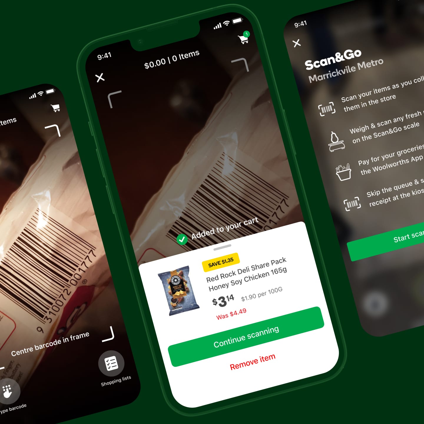
I gave the UI a refresh, prototyped it in Protopie, and researched how to integrate it into the Woolies app.
Scan&Go originally existed as an experimental app that lived outside the main Woolworths app.
After the success of the Rewards project, I was asked to explore how the Scan&Go app could be integrated into the main Woolworths experience.
The main challenges of this were how customers would activate the feature within an already complex and feature-rich app.
While incorporating Scan&Go into the main Woolies app, I also explored how its UI could be modernised and updated to be cohesive within the wider experience.
I created refined UI, along with a high fidelity prototype in Protopie to facilitate user testing of the concept and UI.
Because of various technical constraints, there would be several long loading states throughout the experience. I made sure to build these into the prototype in way that could be easily customised to simulate slow network speeds.

Delivery Now
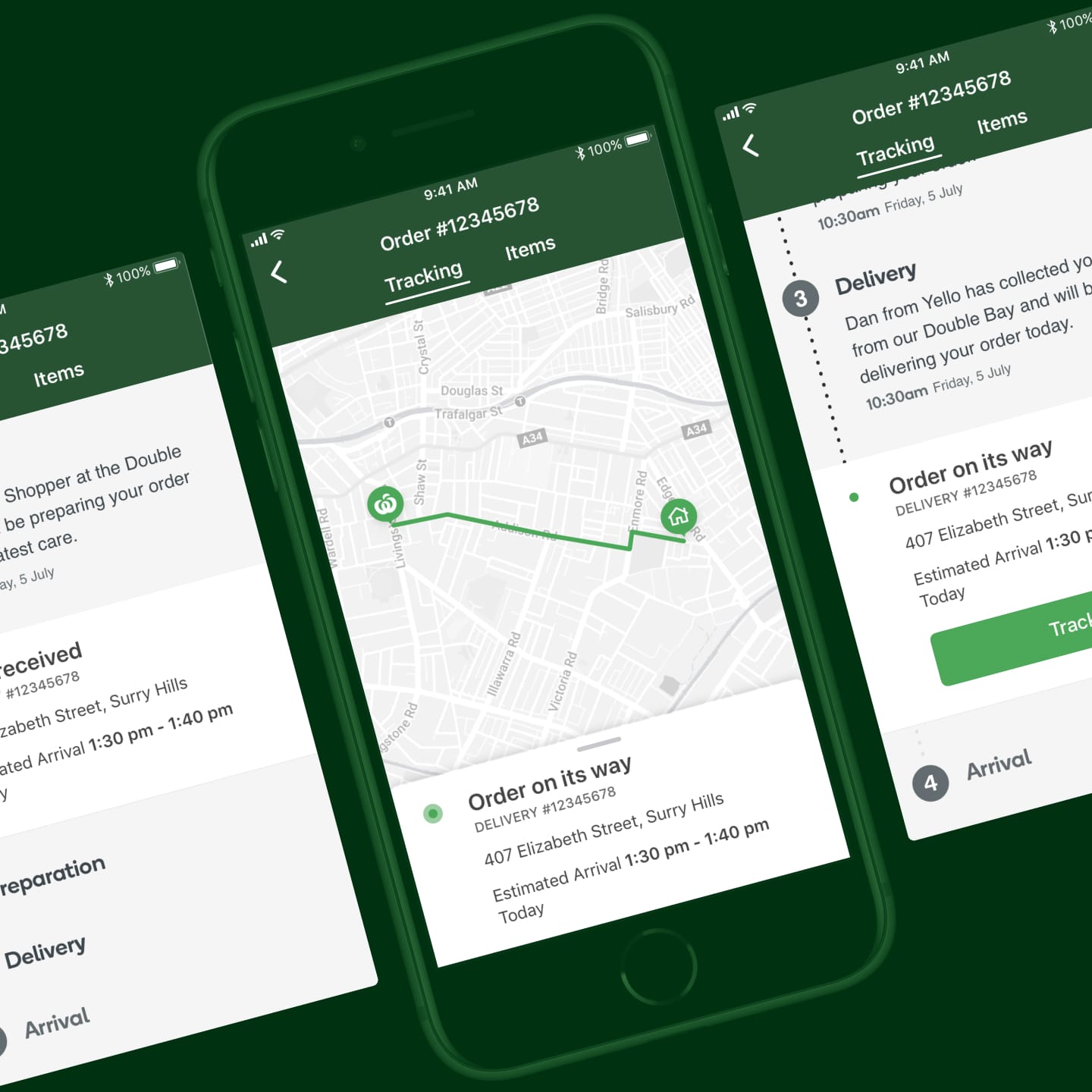
Bringing the Uber Eats-like grocery service to the app with research and iterative prototyping.
Delivery Now was first created only for the web experience for Woolworths.
I was tasked with integrating it into the Woolworths app as another option for delivery.
After creating a few initial concepts, I whipped up a quick prototype with InVision and tested with a handful of customers to validate.