Optus Sport
Product Design Lead (Contract)
2019
I led the planning, strategy, and design for the redesign of Optus Sport
Strategy
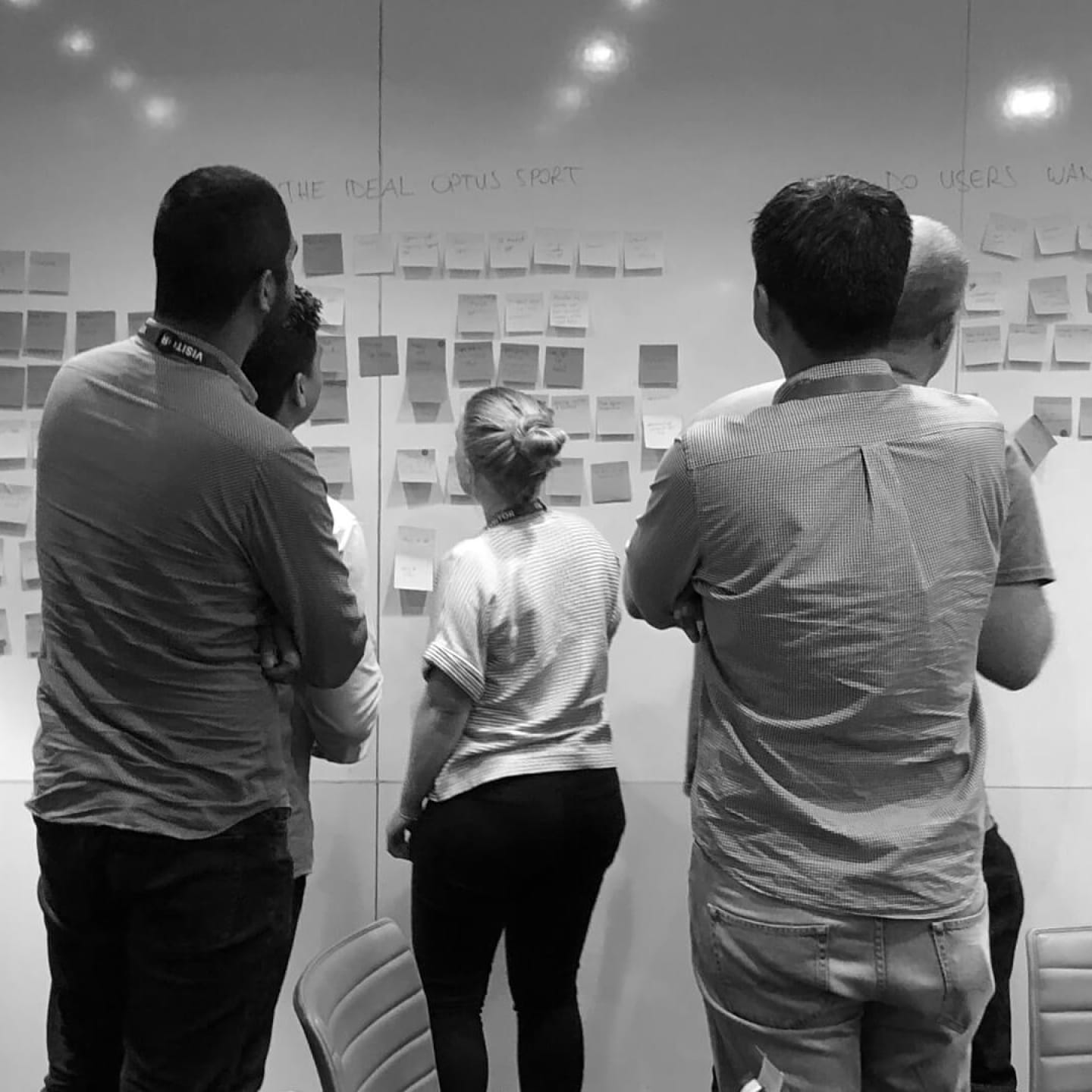
To kick off the project, I facilitated stakeholder workshops to identify a strategic direction for Optus Sport moving forward.
I facilitated collaborative workshops with stakeholders to identify the product vision for the future. This involved getting everyone in a room together, and discussing a vision for what Optus Sport should and shouldn’t be.
We explored the needs of current and potential future customers, the strengths of the service, and where we wanted it to be in an ideal world.
This all came together as draft product vision statement. Something crafted from stakeholders representing all parts of the business, from which all teams could align and rally behind.
After taking this draft away and refining, I presented the final product vision back to the group to align with senior stakeholders and internal teams.
From here, we had our direction and alignment and could get cracking on some intense research and exploration of new concepts.
Research & validation
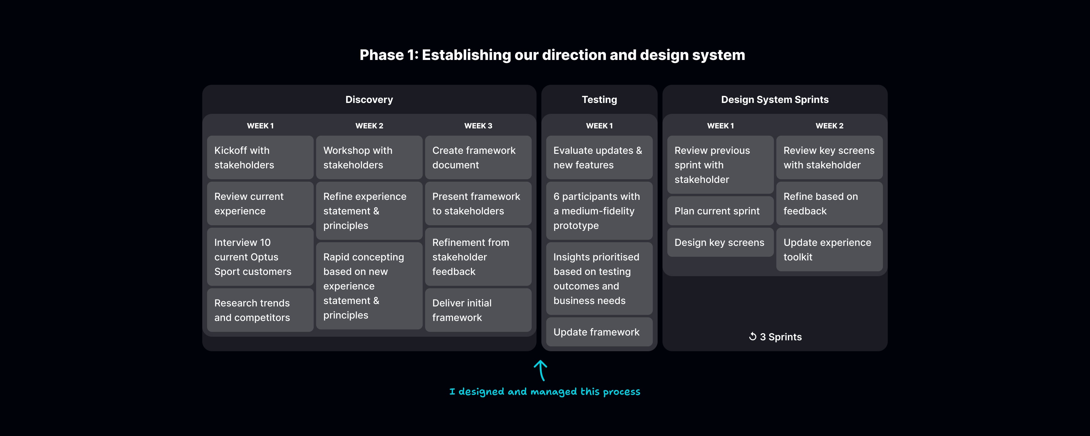
With our product vision in place, I then conducted interviews with existing customers to identify pain points and opportunities. What gaps do have in serving their needs right now, and in achieving our vision for the future?
With most people using Optus Sport to watch the English Premier League, a few patterns emerged when it came to the routines of users watching matches out of their own timezone. This mapped closely to their level of fandom, with hardcore fans likely to wake up in the middle of the night to watch their team live, and more casual fans being happy with replays.
It was critical to understand the ups and downs of this weekly routine in order to serve each of these types of viewers.
After collecting insights from these interviews, we (myself and one other designed) created concepts to address shortcomings in the service and performed user testing to evaluate them.
We also created three separate visual directions for the product, ranging from a radical new look to a small refinement to the current product, and included some preference testing among our participants as a temperature check.
This rapid concepting helped to validate or rule out new ideas, with results presented back to stakeholders to align on the product vision moving forward.
The experience design toolkit
It takes many teams all pulling in the same direction to create a product at the scale of Optus Sport.
It can become a real challenge to make sure everything remained consistent with so many teams working independently.
With the experience design toolkit, we set out to deliver our high-level vision across the whole service. Any team could use the toolkit to interpret the overarching vision, regardless of their platform of focus.
We made sure that key screens and features were highlighted, demonstrating how they connected back to the core vision of what Optus Sport should be.
This gave concrete examples of how we expected the vision to be implemented, while still leaving enough wiggle room for teams to embellish on their own.
I led the creation of the toolkit, which included using a pre-made framework to help with the initial structure.
As we continued with the project in our detailed design phase, the toolkit was updated and refined as a living document.
Detailed design
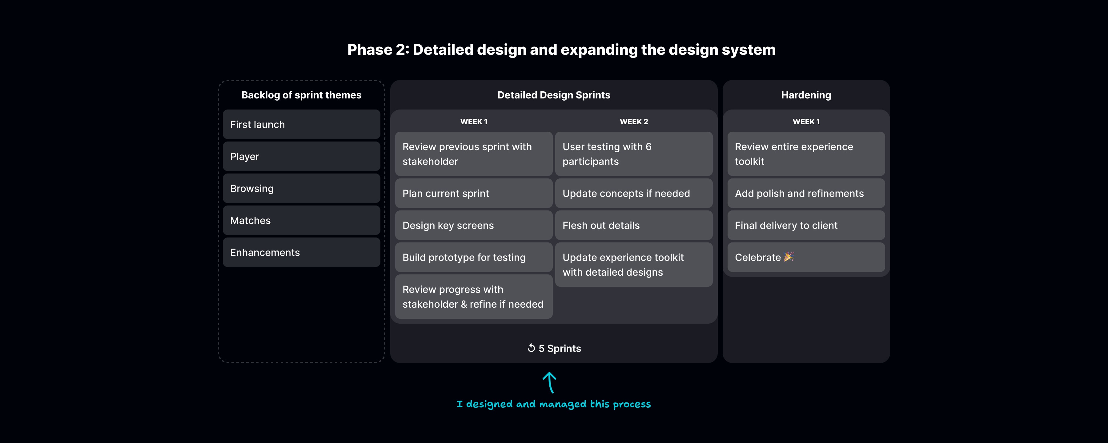
The detailed design phases of the project involved breaking a fixed period of time into 2-week sprints. To kick this off, I worked with our primary stakeholder at Optus to make a backlog of features for these sprints.
This gave us a solid plan to move forward with, along with the flexibility to change direction rapidly if we uncovered new areas to explore.
In each sprint, we spent the first week creating high-fidelity screens and prototypes for a handful of features. We tested these with about 6 people in the second week, and then refined based on the insights gathered. On the last day, we presented the refined UX and UI back to stakeholders, and decided together if we’d move on to the next feature or make further refinements.
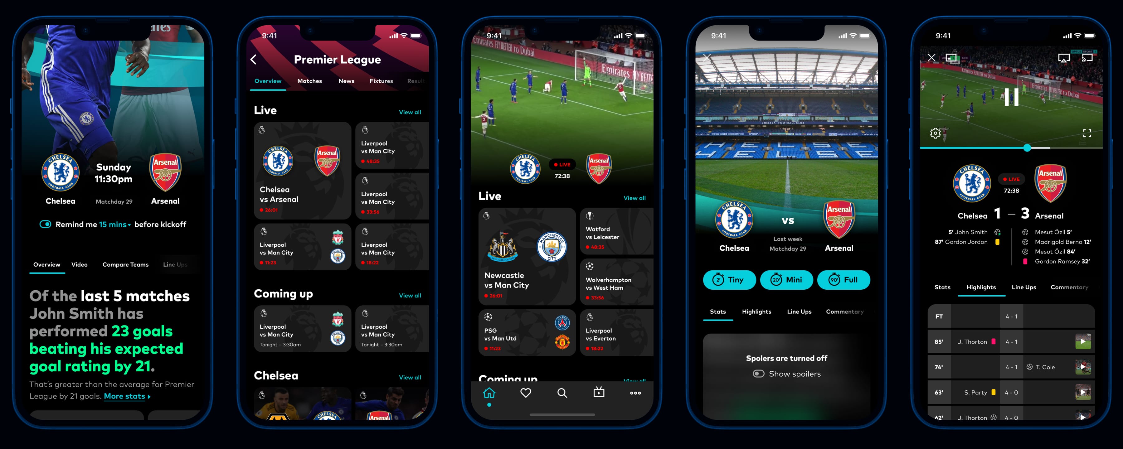
Mobile was our lead platform as we worked through the detailed design phase, with designs for tablet, web and TV being an evolution of those.
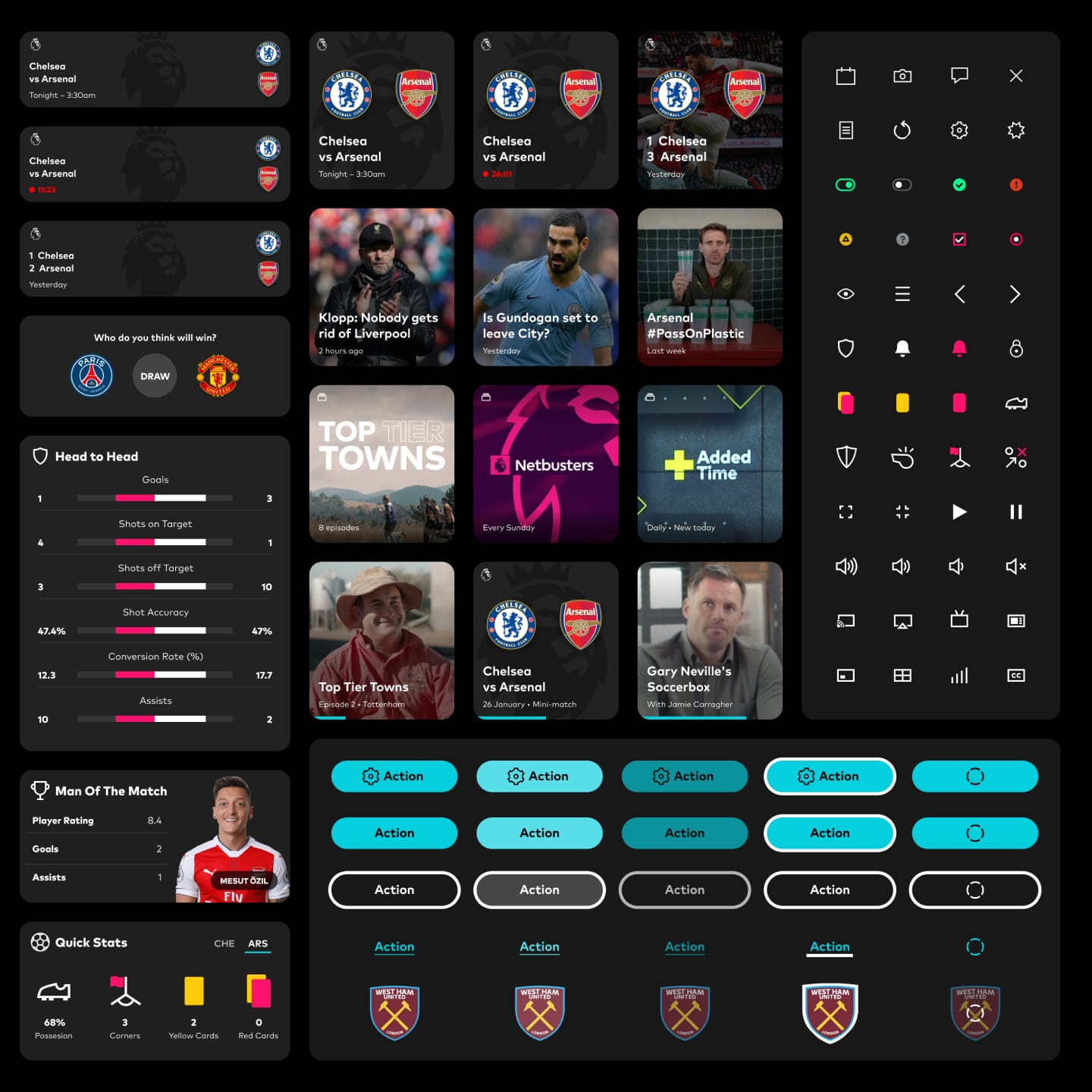
The final deliverable of the project was an online toolkit to establish a baseline experience for all team members, along with high-fidelity screens for the whole app across mobile, web, and TV.
