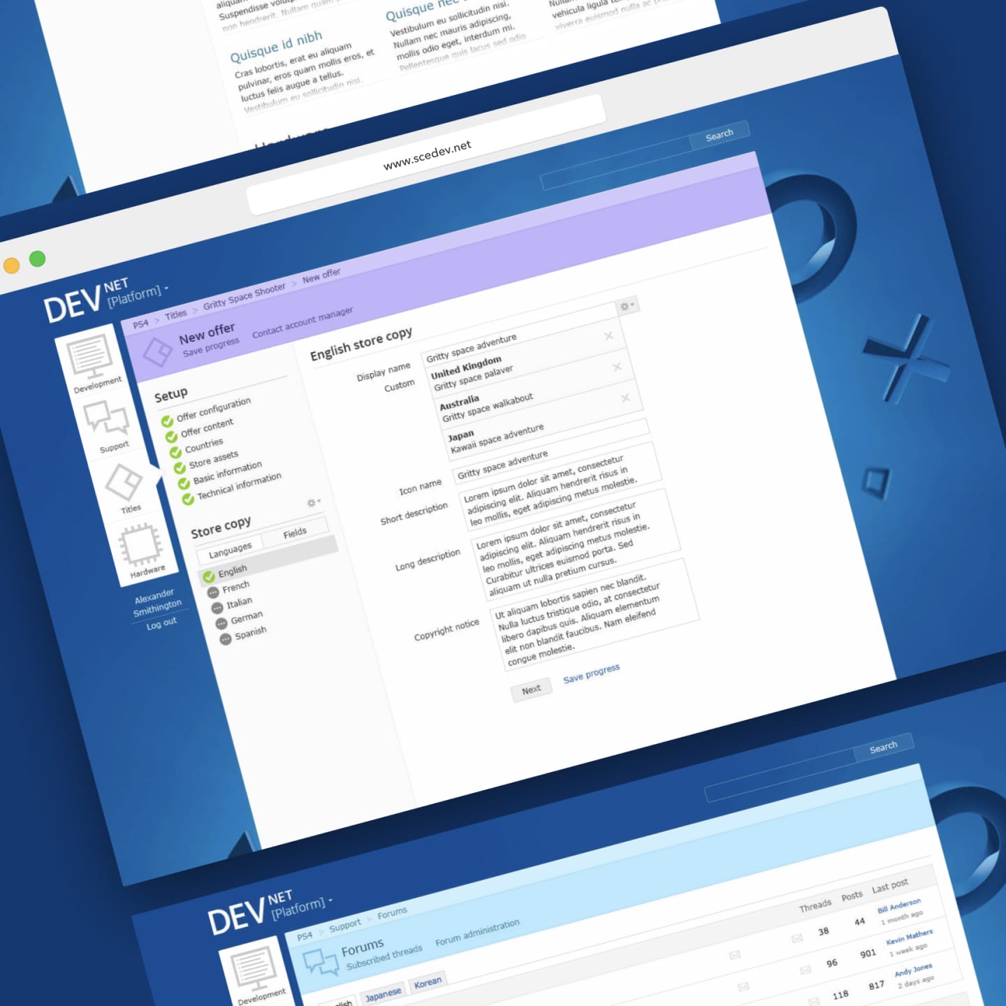
PlayStation DevNet
Senior Web Designer
2012 --> 2014
I joined as the first designer on a decade-old project. I worked on a visual overhaul, and redesigned the navigation and search.
Critical for game devs
DevNet is PlayStation's global development platform, facilitating developer and publisher support, internal communication, documentation, file consumption, and the management of several bespoke processes key to PlayStation development.
At the time of starting the project, DevNet was — and still is — critical to the creation of PlayStation games for developers and publishers across the world. It had been developed internally, and grew organically without a meaningful design effort for over a decade.
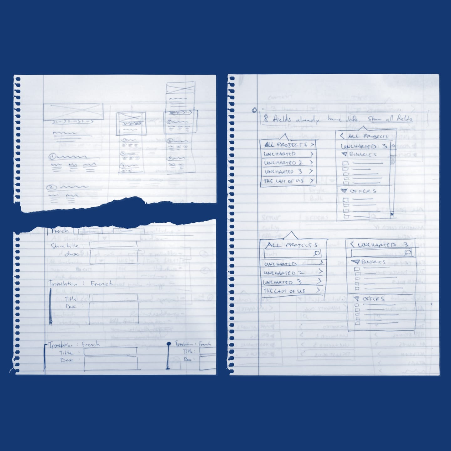
Research to wireframes
A research-led project. I conducted extensive interviews to identify the lowest hanging fruit for refinement.
Usability and design were front-of-mind for the team, but what’s the best way to approach the redesign of a platform so critical to the business? Answering that question became a central part of the project as it started.
Clues to find the answer came from extensive interviews and reviews with users of all stripes. From support staff using the platform all day every day, to game developers accessing documentation and SDK updates, to publishers getting things out the door at the end of a long development cycle.
Moving forward we identified critical changes to be made. The platform’s main navigation was to be overhauled along with significant signposting updates, including breadcrumbs, quick links and colour coding. While making these structural changes, a fresh coat of paint would be applied across the board.
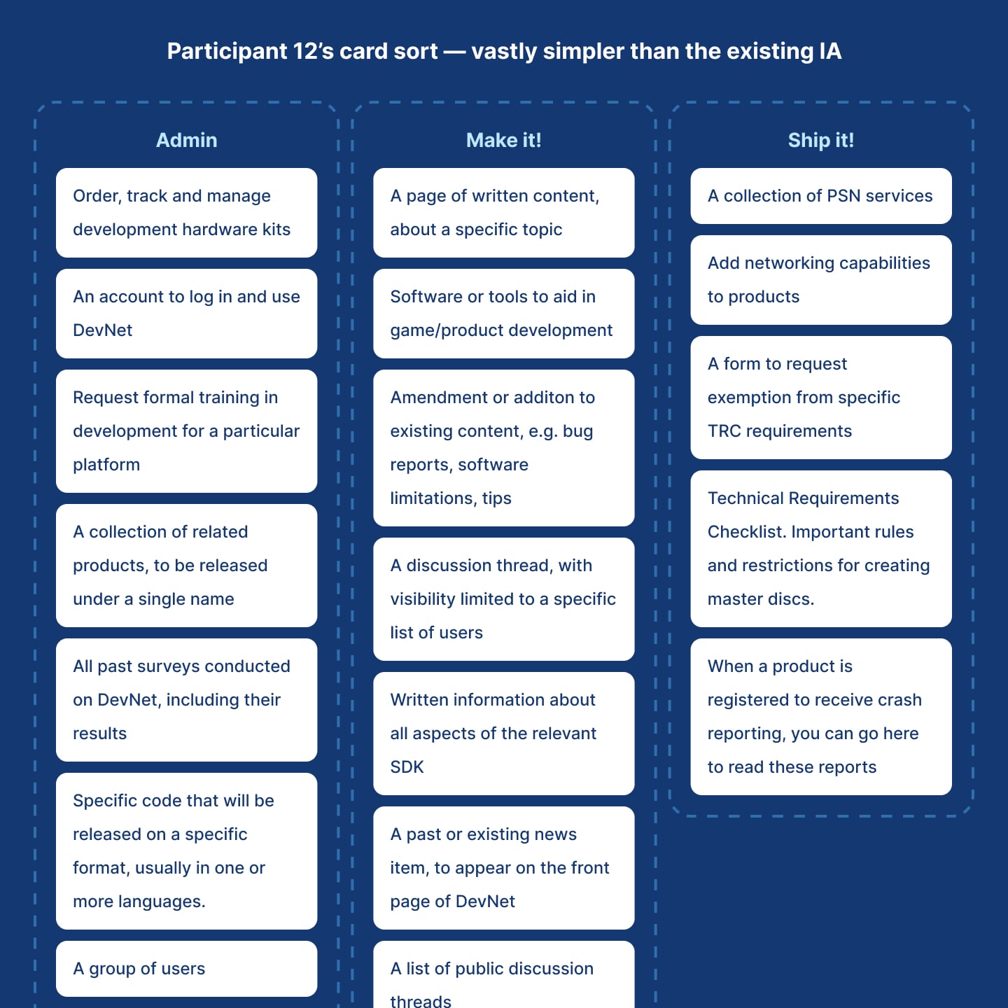
Cart sorting our way to a coherent IA
Knowing the path forward, it was important to gather more data to inform the updated information architecture and structure of the site.
Time for some card sorting! Each area of the navigation was painstakingly documented and given to dozens of users to sort into categories. This data provided invaluable insight into how various users understood content on the platform, and was used to form the redesigned IA.
This research also revealed unexpected insights into how some users prioritised content on the platform. When being asked to name their content groups, one developer used “Docs”, “Support” and “Other shit I don’t care about”. Again, this all factored into how we promoted various content within the redesigned navigation.
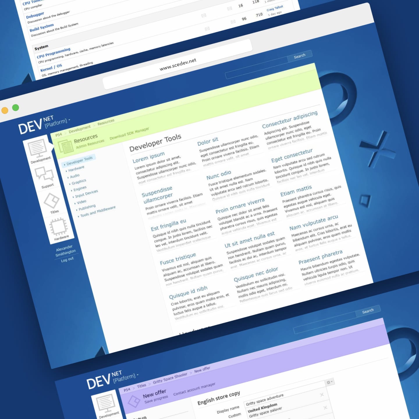
Prototyping to success
Prototyping was a core practice in the redesign project and was crucial to its success. Prototypes were various levels of complexity, from sketched paper prototypes all the way to fully-functional builds polished for production.
Regardless of the complexity, the goals were the same — determine users’ understanding of the new UI; document any potential usability issues; iterate quickly. Testing with about half a dozen people turned out to be the magic number. That way the testing cycle was kept short enough to iterate on a prototype multiple times within a single week.
Depending on the scale of the insights I needed, I tapped different types of people for testing. For small bits of UI, I was able to test within the team for very rapid turnaround.
For larger pieces of work with more certainty needed, I went to outside teams within PlayStation, game studios way out of the city, and even on a trip to Japan to test with non-English speakers when validating a completely re-worked IA. Testing via a translator was a really fun experience!
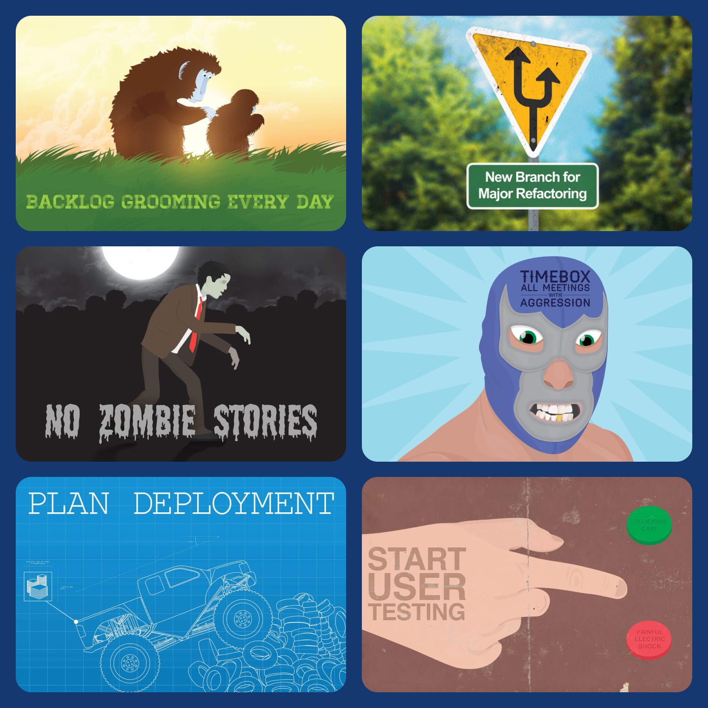
Scrum postcards
An illustrated series of postcards depicting sprint retrospective actions, used as office decoration.
As part of sprint retrospectives at PlayStation, action items are often generated to address any changes or additions to processes or workflows. This series captures a number of ongoing actions, and are used as decoration around the office.
They are printed as real postcards, and were occasionally mailed across the pond to other teams engaged in the project.
Artwork was created using a mix of Photoshop and Illustrator.