Scan&Go Trolleys
Senior Product Designer
2024 --> 2025
I looked after the UX, UI, and prototyping for this new in-store shopping experience.
Overview
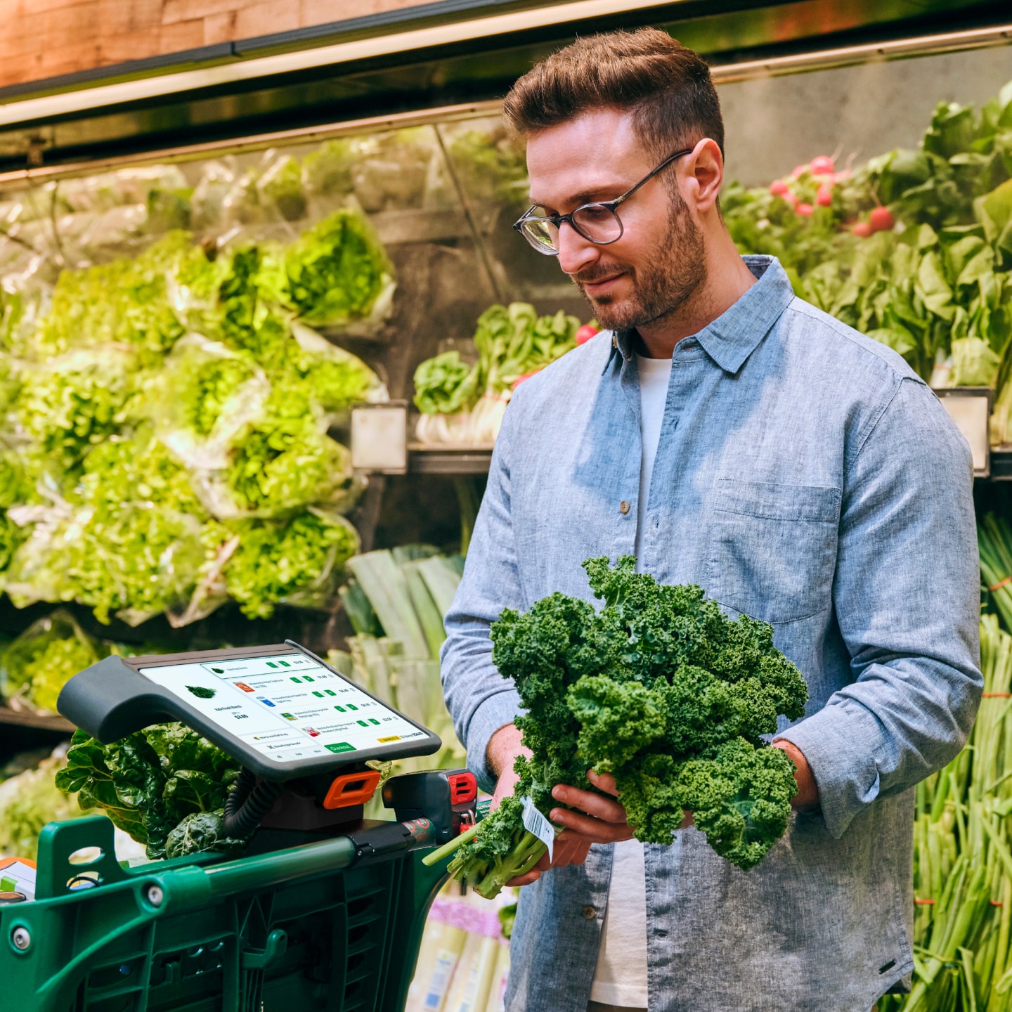
Scan&Go Trolleys is an in-store shopping experience at Woolworths. Customers attach a tablet-sized device to a trolley, scan items throughout the store with its built-in barcode reader, and then pay directly on the trolley. It's a self-checkout on wheels!
I designed the bulk of the UX and UI, using Figma for product design, and After Effects/Lottie for animations. I worked closely with a service designer, product manager, development team, and wider in-store operations stakeholders to shape the experience.
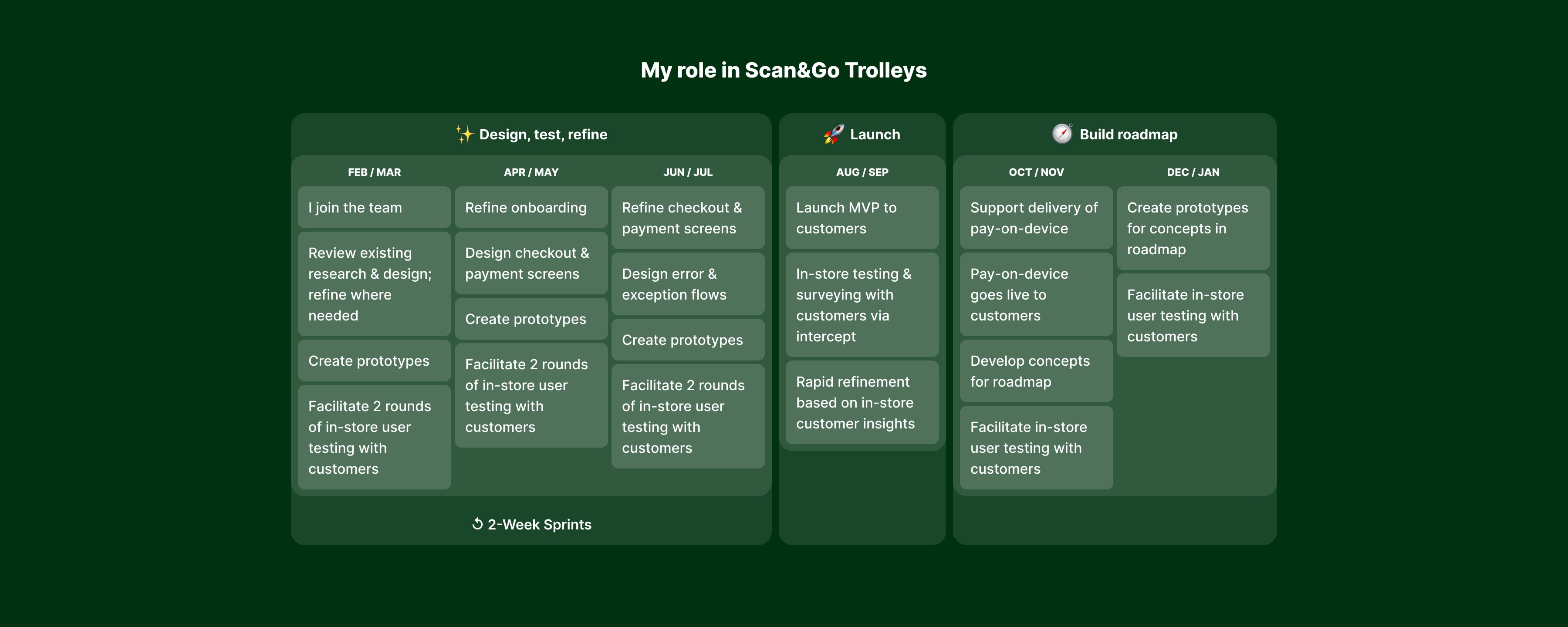
I joined the team in February, with some initial concept work being done ahead of my arrival. Scan&Go Trolleys went live to customers in August of that year.
Research & iteration
Given the unfamiliarity of this type of experience with most supermarket shoppers, user testing was critical in shaping the product. From when I joined the team in February, we conducted six rounds of in-person user testing ahead of the product’s launch in August.
We set ambitious time-boxing to gain enough confidence in the product we were designing, without burning too much time before launch. This was roughly kept to two-week sprints — one week of initial design exploration and prototyping, and one week of in-store testing and refinements.
In this period of rapid testing and iteration, I looked after the design and prototyping in Figma while working with our Service Designer, Product Manager, and relevant stakeholders for feedback and refinement.
Prototyping challenge 1: The hardware
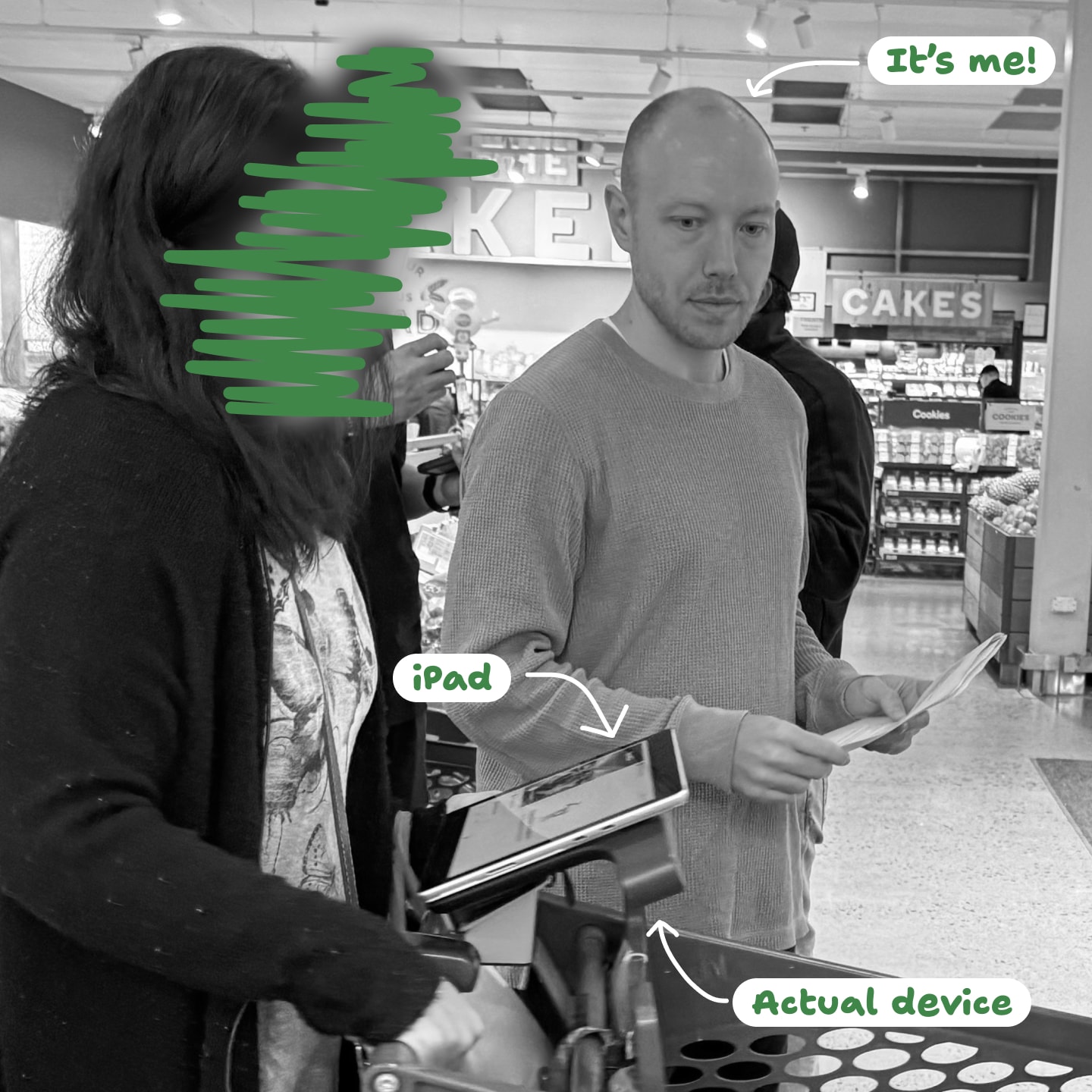
While user testing before launch, we had access to a hardware unit but no way to run software on it. How could we prototype and test our designs in a way that would be realistic enough to get reliable insights?
We found that a fairly low-fidelity solution actually worked very well. We strapped an iPad onto the pre-launch device, and ran a Figma prototype from there.
Prototyping challenge 2: Scanning items
Another challenge would be simulating the scanning of items. Given this is a primary interaction method for customers, it wasn’t going to be good enough to ask participants to tap the screen or use their imagination when scanning.
Our solution was to use a bluetooth keyboard along with the iPad, and use various keypress events to trigger actions in the prototype while standing a few metres away. This meant participants could get into the zone of their shopping, without feeling like we were in control.
Prototyping challenge 3: The beep
As any supermarket shopper knows, the beep of the barcode scanner is a critical piece of feedback. With audio playback not supported in Figma, I used a hack with embedded videos to get it done. This proved to be essential in creating a sense of realism and suspension of disbelief for participants.
Challenge: Starting the shop
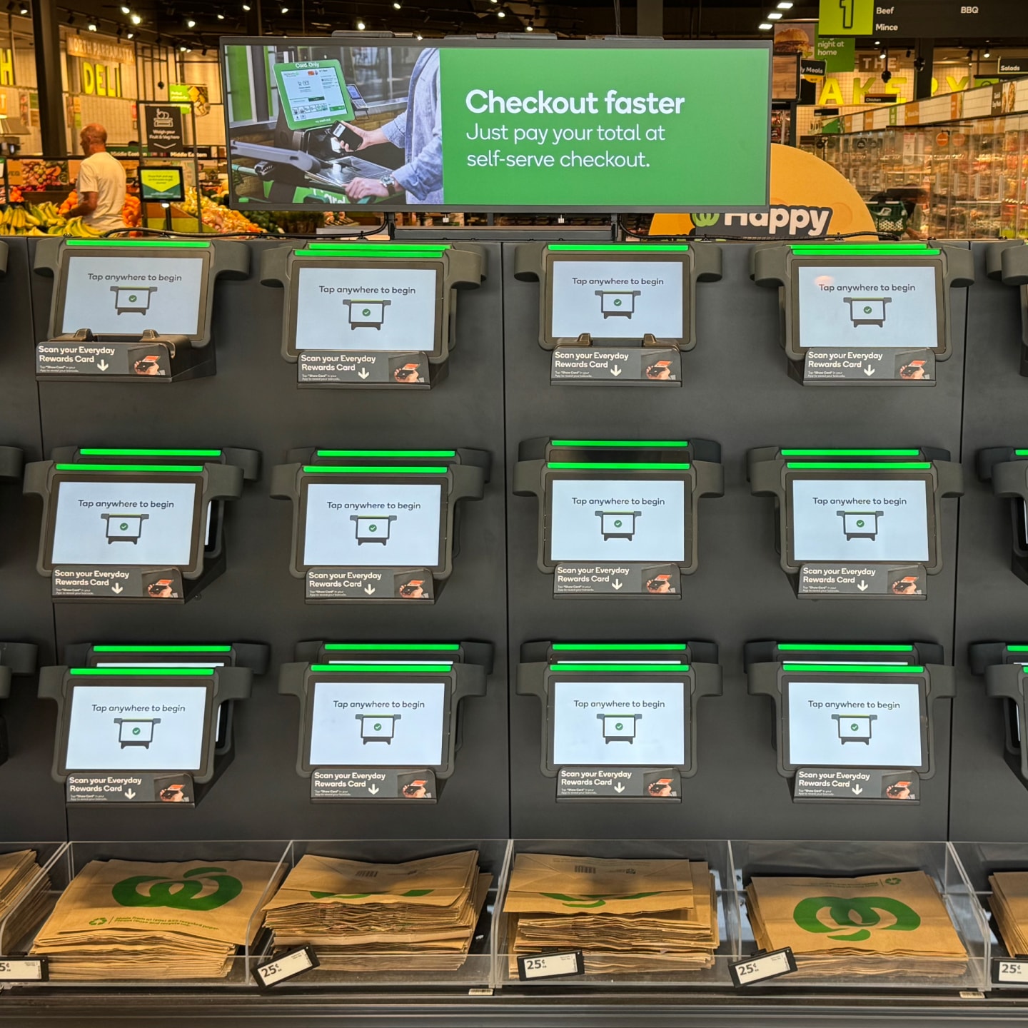
Each of the devices for Scan&Go Trolleys are locked at the front of the store. To start a shop, customers scan their Rewards card to log in and unlock a device.
Unfamiliar
This whole process is completely new to all customers. We needed to find the right balance of walking new customers through it, while not delaying returning customers.
Signage considerations
By and large, signage around the device wall was used to attract new users, while the device itself was used to walk customers through the login process step-by-step. We also used some smaller pieces of signage around each device to highlight areas we knew would be challenging, like the location of the barcode scanner.
Tech risks
Ahead of the launch, we also didn’t know how long the login process would take. Estimates at various times ranged from 2 to 10 seconds! With that in mind, I designed a loading state that could keep people occupied if the worst turned out to be true. We used it as another learning moment — cycling through some of our key benefits and tips to get the most from the service.
Challenge: The hardware
The lead time for hardware changes can be quite long. We could gather and provide feedback about the hardware throughout our testing, but it was very unlikely that the hardware could be changed for launch.
Scanner location
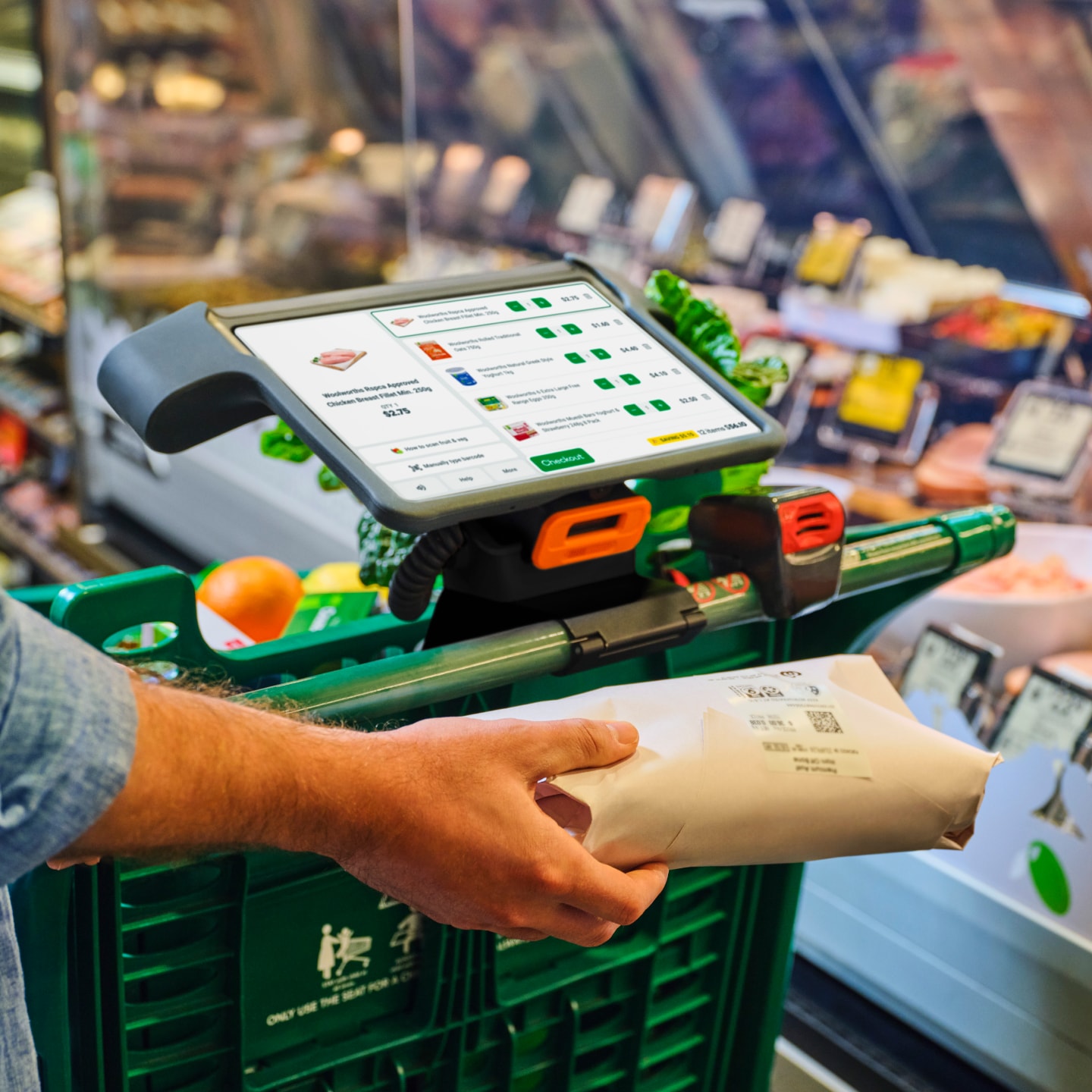
The largest of these was with the location of the physical barcode scanner. When standing over the device, the scanner is located under the screen at the front. Because of how it’s angled, it’s mostly invisible once you get started.
While we found in testing that scanning normal barcoded items was very easy, almost no one realised that the scanner could be detached. This is critical for scanning fruit & veg, and also paying for your shop at the end.
Helping customers
It’s a bit of an old trope that users don’t read things. We found that to be especially true for Scan&Go Trolleys because of the busy and distracting environment our users find themselves.
There really wasn’t a silver bullet to inform users about this bit of functionality — popups would be dismissed without being read, tooltips ignored, and so on. The solution was to integrate this info multiple times and at various parts of the journey. Empty states proved to be great real estate for giving nudges about functionality without interrupting too much.
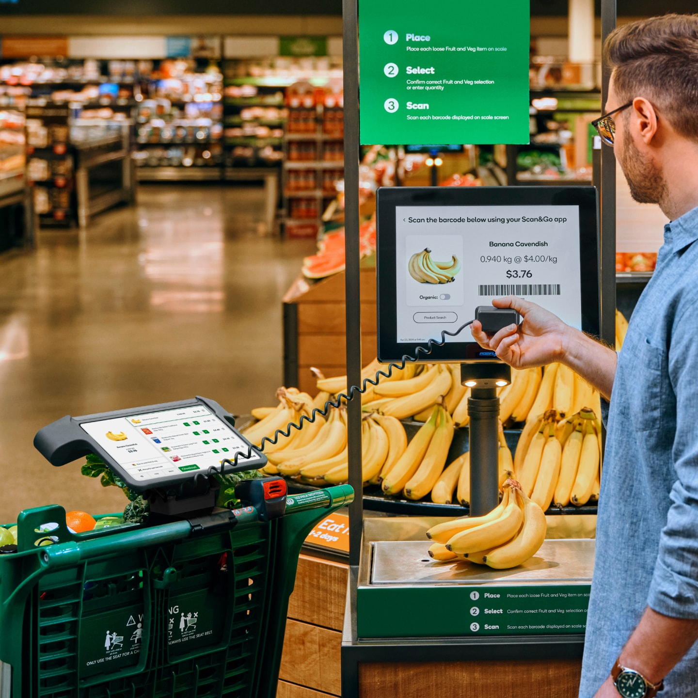
Using the smart scales to add fruit & veg
Challenge: Fruit & veg
A common question people have when trying Scan&Go for the first time is about fruit & veg. How do you add weighted items if there is no scale in the device or trolley?
The process
Customers can place an item on smart scales in the fruit & veg section. Items are then recognised and weighed. A barcode is displayed on the screen, which has both the product and weight embedded. This can then be scanned by the device to add it to their shop.
Helping customers
This is another new process for people to get their heads around, and is usually the first place that people need detach the scanner.
We knew this would be an issue, so placed some guidance front-and-centre — a big, prominent button with a colourful icon and the label “How to scan fruit & veg”. This pointed to some show-don’t-tell-style instructions with simple text and large photos to demonstrate the process.
This was easily found and very effective in helping people understand the process, both in pre-launch testing and in observations when live.
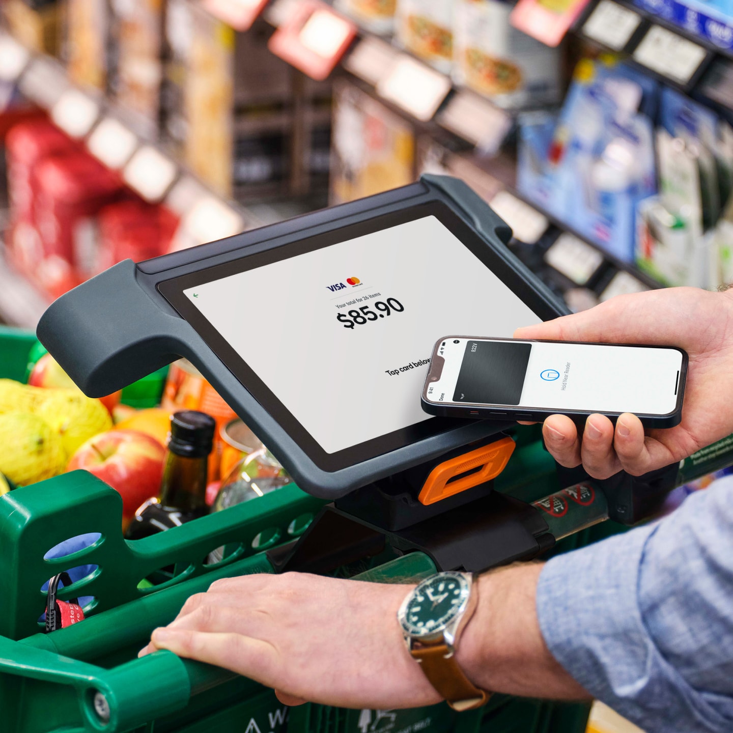
Challenge: Payment on the trolley
A key benefit of Scan&Go Trolleys is the ability to pay directly on the device. This means you can pay anywhere in the store, then walk straight out without having to line up or deal with the checkouts.
We wanted this flow to be as simple as possible, while still acknowledging that this is a new experience that comes with many changes in behaviour. With prototyping and user testing, we tried several different versions of the checkout flow to find the right balance of efficiency vs understanding and control.
Efficient vs understandable
On one end of the spectrum, we tried a version that minimised the number of steps by packing more actions and information into denser screens.
With the in-store environment being so busy and distracting, we found that this approach led to more mistakes and missed information. The more effective approach was to spread decisions and information out over more steps, while making each decision as simple as possible.
Helpful friction
We also found that as people first started to use Scan&Go, it was easy to fall back into old habits. Very frequently, people would forget to scan their items — dropping them straight into the trolley.
Using a more spread out structure for the checkout allowed us to add points of “helpful friction” to aid those still adjusting to this new workflow. One example is a gentle nudge at the beginning of the checkout flow, asking if all items have been scanned and bagged.
Technical unknowns
Because of some technical limitations, we also had several points where loading times may have been an issue — an unknown during the concept phase, but something we were aware would be a likely outcome.
I made sure the designs were flexible enough to include determinate loading indicators if necessary, and scattered playful animations throughout the flow to keep things lively and engaging.
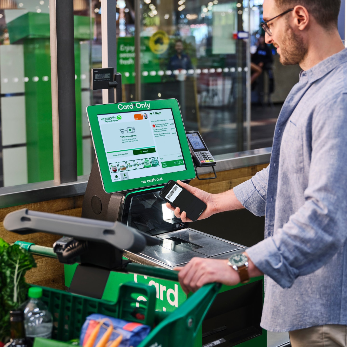
Transferring a shop to the self-checkout
Challenge: Payment at self-checkout
The ideal checkout experience for Scan&Go Trolleys is to pay on the device by tapping your card. But what about people who like to pay cash? Luckily, we were able to tap into the existing self-checkout registers to handle payment types like this.
To handle cash payments (and other processes like scan checks or interventions for age-restricted items), you can transfer your shop to the self-checkout. Customers can scan a barcode on a self-checkout machine using the device, which passes a unique ID to the trolley and starts the transfer.
Iterating towards the best solution
As with fruit & veg, it’s a bit of an unexpected process to go through. I explored and tested several different approaches — from being very detailed in outlining the process to overly simple. I also tested various ways to visualise the process with illustrations, animations, and photos.
Supporting the in-store team
Knowing that Scan&Go does not operate in isolation was very important when mapping out this process. Team members are incredibly under the pump at self-checkout, and we wanted to ensure we weren’t adding to their workload if we could avoid it.
In testing, we found that (in the case of scan checks or item interventions) if we emphasised the team member’s involvement too much, customers would naturally want to engage them immediately. This wouldn’t be ideal, because their shop would still need to be transferred to a self-checkout machine — something customers can manage themselves first to save the team member’s time.
We found that keeping the focus on transfer instructions worked best, both in explaining the steps required and nudging customers to kick this off themselves.
Long loading times and limitations
The actual transfer process also presented some challenges. Shortly before launch we discovered that the transfer could take anywhere between 10-20 seconds. In addition, the trolley device itself would get no feedback from the self-checkout that a transfer had been completed. That’s a long time for someone to look at a static screen without knowing if things were still moving along.
Because of this, we pushed for changes to the self-checkout UI to display a determinate-style loading indicator over an indeterminate one. This relatively small change was enough to give feedback to customers that things hadn’t gone wrong in the transfer.
Launch & follow-up research
After many rounds of in-store testing with prototypes built in Figma, it was exciting to head into stores to see customers do their actual shopping using real hardware and software.
During the early stages of the launch, I went into a few different stores to observe customers using the product, and intercepted them on their way out to survey and interview them about their experiences.
Overwhelmingly, we found people were very positive about the experience. This was backed up by our usage metrics, which were far above our pre-launch targets and showed a high rate of repeat-usage.
As with every new product, we did identify several areas of improvement. These ranged from small enhancements to larger issues we worked more quickly to address.
Learning: The scanners
The first part of the journey is one of the most important for customers, especially if it’s your first time. To unlock a device from the wall, customers need to scan their Rewards card to log in.
Before launch, we tested this by acting as the wall ourselves — holding a device and not releasing it until a customer had successfully logged in. This differed from reality in one key area: the device wall is double-stacked, and the barcode scanners are very sensitive.
After launch, we saw many customers scanning both the front and rear devices on the wall. This created a race condition and a pretty poor experience if the rear device logged in first.
To address this, we added an extra step to the login flow. First, customers would tap the screen to activate the barcode reader before scanning their card.
This had a few knock-on effects with printed collateral and needed to be refined based on further observations, but was an acceptable solution for the medium-term.
Learning: The wifi
Knowing that teaching people about prickly parts of the experience was going to be important, we made the choice to host help and tutorial content on a remote CMS.
This would give us the flexibility to adjust this content outside of the app release schedule, meaning we could respond to observations in-store much more quickly.
All of this was true at launch, but was undone by one small issue: the wifi speed in the store. Depending on the busyness of the store, there were times when the help content loaded agonisingly slowly.
Our biggest pain point from this came from people learning how to add fruit & veg. Everyone found our helpfully placed button for the help content, but would often give up before it had loaded.
With this in mind, we opted to bake the help content into the app so that it could be shown to users instantly. Better to have a much nicer UX than an easier content management process.
Learning: The environment
It’s a pretty classic mantra in product design that users don’t really read things.
We found this to be even more pronounced in a busy supermarket environment. It's just way more hectic than using a phone app in the comfort of your living room.
With so many new behaviours we needed to explain to users, the learning from this was to be absolutely ruthless in what we display on screen. Copy has to be short, sharp, and to the point. Any popups or disruptions have to be of high enough value to justify the extra noise and cognitive load.
Feedback
From comments during user testing, to surveys and interviews after launching, here's what some people had to say about Scan&Go Trolleys:
“It was very easy to use, and provided a much more pleasant shopping experience.”
— Survey comment
“My husband and I are in our 70s and we find it very good.”
— Survey comment
“Super easy to use. I'll definitely use it in the future.”
— Customer interview
“As someone living with PTSD, I often find shopping overwhelming and stressful. The Scan&Go service allowed me to shop at my own pace and avoid crowded checkouts, which significantly reduced my anxiety. I particularly appreciated the convenience of scanning items as I shopped. It made the experience much less daunting and allowed me to maintain a sense of control. Thank you for offering this service. It has made a real difference in my shopping experience.”
— Survey comment
“Makes checking out so much easier especially when shopping with special needs child don’t have to worry about him running off at check out”
— Survey comment
“Using Scan&Go was a fantastic experience. Improving my time for shopping, understandable operating system. I pack my purchases only once, great idea. And at the end I know how much I will pay and how much I have saved. Thank you very much for introducing Scan&Go.”
— Survey comment
“Woolworths' Scan&Go technology is a remarkable step forward in making shopping more efficient and enjoyable. The system is impressively intuitive and user-friendly, allowing customers to easily keep track of their purchases as they shop. This real-time update feature is a huge plus, ensuring that you always know exactly what you've picked up and can monitor your total as you go.”
— Survey comment
“I’m a Mum of 3 (3yr old and 6 month old twins) and as soon as they’re all in bed I do a quick grocery run. The scan and go has made my trip so much more efficient and I love that you can pack it all away into bags as you go along, so all you have to do is scan and pay upon checkout. I found the system to be very user friendly and I’m excited to use it again for my next grocery run.”
— Survey comment
